Advertising your business, whether in print or online, helps increase awareness. However, these promotions can be expensive and take time to create.
But the good news is that having a friend or client recommend your product or service is easier.
Word-of-mouth referrals are powerful. Why? 84% of people from 58 countries say that they trust recommendations from friends and family (Nielsen). Referred customers have a 30% higher conversion rate, a 16% higher lifetime value, and a 37% higher retention rate (Saasquatch).
That’s why they should be a key part of your sales and marketing plan.
In this post, UpPromote will walk you through:
- Customer referrals definition & benefits
- What are customer referral program
- How to create a successful referral program (in 8 steps)
- 5 Best ideas for a referral program
- How to set up a customer referral program with UpPromote?
- Examples to copy from
Let’s dive in!
With an easy referral program setup, attractive rewards, and robust tracking, UpPromote is the perfect tool to grow your customer base.
What are Customer Referrals?
Customer referrals are a type of word-of-mouth marketing. They happen when happy customers tell their friends or family about a product or service they love. This can be through a chat, a conversation, a social media post, or a referral program.
These referrals leverage the trust and credibility of personal recommendations, making them a powerful way to acquire new customers.
Why Customer Referrals Are Important?
A strong customer referral strategy comes with plenty of perks, including improving trust and boosting conversion rates.
However, some top benefits that can really make a difference include:
First of all, it’s about cultivating brand loyalty and fostering trust. When a friend or family member recommends a product, it feels more trustworthy than any ad because people trust their loved ones. Therefore, a customer who comes through a personal recommendation is more likely to stick around and become loyal.
Referred customers also tend to have a higher lifetime value. They already trust your brand because someone they know vouched for you. This means they’re more likely to come back again and again, boosting their overall lifetime value.
Referral marketing is a cost-effective strategy. It leverages existing customers to bring in new ones, reducing the need for expensive advertising campaigns.
Additionally, it often leads to higher conversion rates, as referred potential customers are significantly more valuable to brands than non-referred customers. Even if every referral doesn’t convert into a customer, it still expands brand awareness. These referrals may mention your brand to others who could be more interested in engaging with your business. This is a key way companies grow their brand recognition.
What Are Customer Referral Programs?
Customer referrals are marketing strategies designed to encourage existing customers to refer new customers to a business, as we mentioned before.
However, managing these referrals can be tricky without a proper system. That’s why customer referral programs are essential. They help you track and reward referrals without manual tasks, making sure everyone benefits and feels appreciated.
A referral program, or refer-a-friend program, is similar to affiliate marketing but with a twist. Instead of paying affiliates, you reward your existing customers with credits, discounts, and gifts for bringing in new leads.
How does a customer referral program work?
- Existing customers get a unique link to share with friends.
- Friends use the link to get a discount or reward.
- The customer gets a reward when their link is used.
While client referrals are incredibly powerful, they need to be managed well. That’s where UpPromote comes in—the top recommended Shopify referral and affiliate system software.
Its main goal is to boost sales through affiliates. But it also lets you use store credit as a reward for referrals.
With its referral feature, customers can promote your products without joining an affiliate program. You can start your referral program right away.
How to Create a Successful Customer Referral Program? (In 8 Steps)
Now that you see the value of a customer referral program.
Setting up a referral program is straightforward, but making it truly effective takes more than offering great rewards.
No worries! Let’s explore how to make yours successful.
1. Have a quality product
Did you know that referral marketing programs don’t create new brand ambassadors; they empower the ones you already have?
Imagine recommending a product to a friend, only for them to be disappointed. You’d feel embarrassed, and your trust in the brand would diminish.
One negative review shared within a friend’s network can undo the positive impact of many referrals. On the other hand, positive testimonials can drive the success of your referral campaigns.
So, focus on the quality of your products first. Happy customers are more likely to recommend your brand confidently to their friends and family.
Take a moment to ask yourself:
- Do my products solve a real problem for my target audience?
- Do they offer a positive user experience?
- Would I confidently recommend them to my own friends and family?
If you can answer “yes” to these questions, you’re ready for the next steps.
2. Define your goals and KPIs
Any marketing strategy requires clear goals and key performance indicators (KPIs) to track progress and success.
So does your customer referral program.
Initially, you need to know what you aim to achieve with your referral program.
Are you looking to:
- Boost sales?
- Expand brand awareness?
- Increase customer retention?
Once you’ve defined your goals, you can set specific targets. For instance, if your goal is to “increase sales,” you might aim to “acquire 50 new customers through successful referrals in the first month.”
Also, you need to select KPIs that will help you measure how well you’re meeting your goals. Common KPIs for referral programs include:
- Number of referrals generated
- Conversion rate
- Revenue generated from referrals
- Return on investment
- Customer lifetime value from the referral program
By setting clear goals and tracking relevant KPIs, you can ensure your referral program is effective and contributes significantly to your overall business objectives.
3. Look at your competitors
Market research might seem overwhelming, but it’s essential for creating a successful referral program.
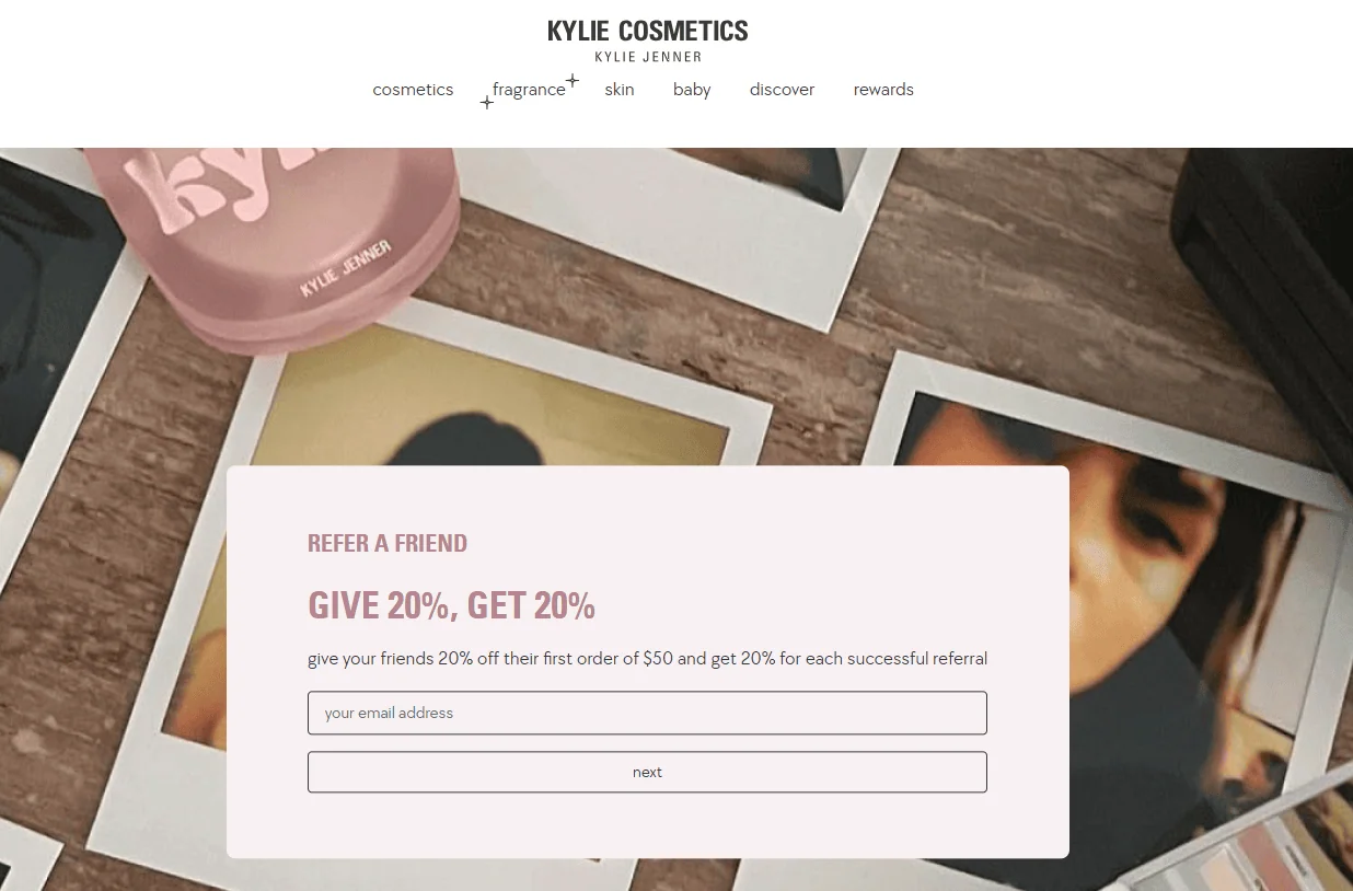
If you run a beauty or cosmetics store, consider brands like Obagi and Estée Lauder. Both brands offer double-sided rewards for the referrer and the referee.
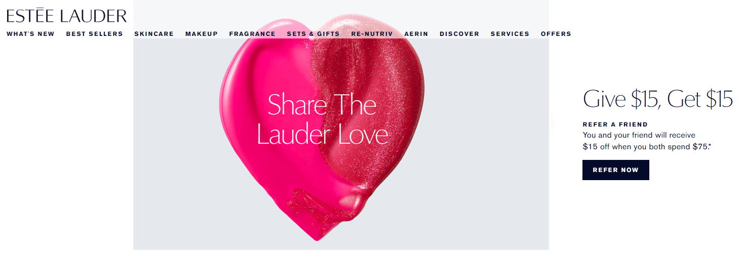
Analyzing competitor offerings leads to the most effective incentive structure. However, remember that it’s not a one-time event. Conducting new research when necessary to stay on top of market trends is essential.
4. Make a list of referral sources
We’ll call these advocates, and they can be anyone you’re connected to now or have been in the past.
Start by listing them out. This list could include:
- Current customers
- Past customers
- Leads that didn’t close
- Industry leaders
- Vendors
This will give you a solid foundation to start with.
Existing customers are often your most powerful sources of referrals. Happy and satisfied customers willingly advocate for your brand. They share their positive customer experience with friends, family, and colleagues, and their firsthand experiences with your products or services are persuasive.
Reconnect with past customers in addition to current ones. Offer referral incentives to re-engage them and encourage them to make organic referrals.
Another valuable referral source is within your own company. Motivate your dedicated employees to speak positively about your program. They can become brand ambassadors. They will share their positive experiences and encourage referrals within their networks.
5. Select the software to run your program
For your referral program to work, you’ll need robust referral program software that notifies both your business and the referred customer when a referral is submitted.
What features should you look for in this software?
- Ease of use and user interface
- Automated tracking and reward management
- Pricing and scalability
- Customer support and training
- Language and currency options
UpPromote is a top-recommended referral and affiliate marketing app. With over 115,000 users and 3,500+ reviews on the Shopify app store, our all-in-one software makes it easy to create a successful referral program.
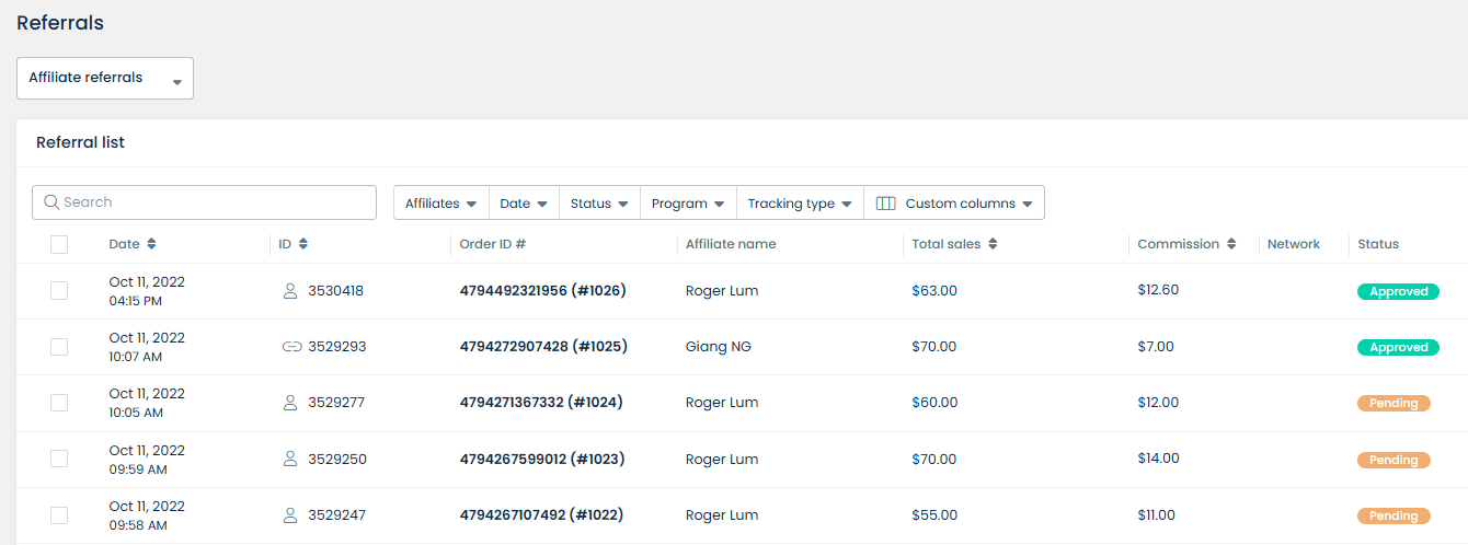
What makes the software a top choice for businesses looking to grow through referrals?
You can add beautiful widgets to every page or customize a landing page that dazzles any device.
But that’s not all.
The app’s affordability is another highlight, starting with a 14-day free trial and then just $29.99 per month.
And here’s the best part: UpPromote’s outstanding support. The 24/7 support team, with an impressive 2-minute response time, ensures that you always have the help you need, making the process smooth and stress-free.
Install UpPromote & our support team will assist you every step of the way.
6. Decide your incentives and rewards
Deciding on incentives and rewards is crucial for attracting participants. Incentives are your program’s sweet spot, motivating prospective customers to join.
Discounts are the most common referral incentive. Yes, that’s right!
However, consider other options to make your program more appealing. Cash rewards, free products, and gift cards are great alternatives. Some brands offer exclusive access to early product launches or limited-edition items. Others use a points-based system or loyalty programs to reward referrals.
What’s even more remarkable? A tiered reward structure can elevate your efforts. Provide bonus incentives for reaching specific referral milestones.
Casper, a mattress brand, offers a compelling two-sided referral program. When a member refers to a friend, the friend gets $50 off a Casper mattress. In return, the member receives a $75 Amazon gift card.
We can’t stress it enough—double-sided rewards are fantastic for conversion.
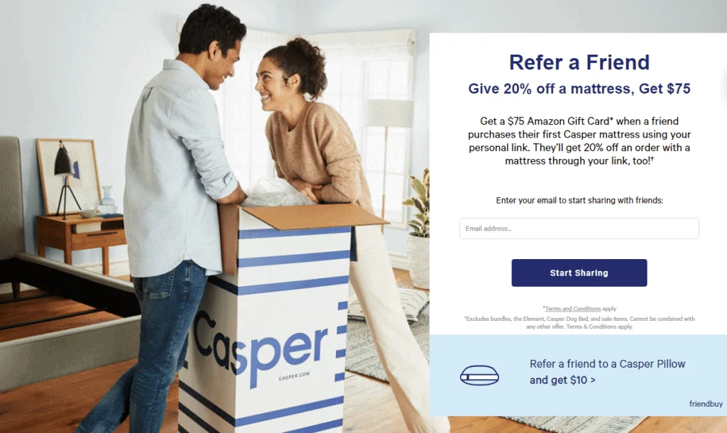
Bonus tip: Balance your reward value with your budget to ensure a great return on investment.
With UpPromote, you can easily set up rewards for customers and incentives for their friends. There are various options that you can select from.
There are two types of customer Rewards: the Flat rate per order and the Percentage of sales that you can set at a certain amount.
Meanwhile, their friends can get a Discount by Percentage, Fixed amount, or Free shipping.

7. Use multiple channels to promote your program
Go beyond a single channel to boost the visibility of your referral program.
Promoting your referral program through multiple channels helps you reach diverse customer groups.
Here are some standard methods:
Let your website and blog do the talking
Featuring your referral program prominently on your website is a great way to attract customers to join the program.
You can include it in the header or footer for easy access. A dedicated landing page describing the program and rewards is crucial. Explain the referral process in detail. Use clear calls to action to encourage sign-ups and referrals.
UpPromote lets you embed a signup form on any page of your store, creating a dedicated space for referral sign-ups. Customers can easily join your referral program and get their referral link to start promoting your store right away.
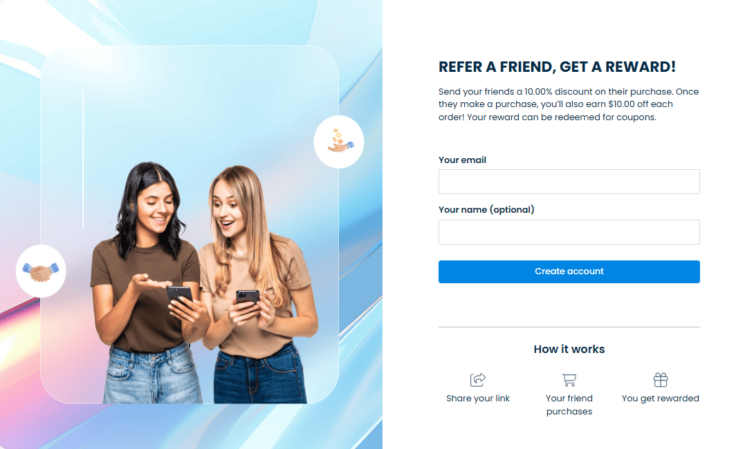
Targeted pop-ups or announcement bars can also attract visitors. If you have a blog, write engaging posts to highlight your referral program.
You can try the widget display from UpPromote. It appears as a floating button on your website. When clicked, it opens a popup where customers can register for your referral program and get their unique referral link.
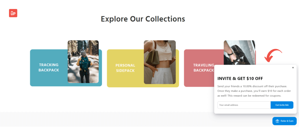
Email marketing also works wonders. You can invite loyal customers to join via referral email. You can mention the referral program in purchase confirmation emails.
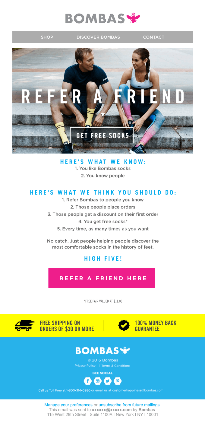
And don’t forget to spread it on social media.
Some tips to promote it:
- Create eye-catching visuals
- Share success stories
- Use hashtags
- Run contests
- Offer exclusive social media perks
To take it up a notch, you can run social media ads. Use targeted referral messaging and audience segmentation to reach the most potential clients.
8. Track performance and optimize your program
Launching a referral program is just the start. For long-term success, track performance and continuously optimize.
To be specific, you need to:
- Analyze data: Use your goals and KPIs to measure effectiveness.
- Identify trends: Look for patterns in metrics to see what’s working and what isn’t.
- Compare results: Review different segments, channels, and time periods.
Optimization involves:
- Focusing efforts: Target channels and segments with higher participation and conversion rates.
- Adjusting rewards: Tailor rewards based on customer preferences and goals.
- A/B testing: Test variations of rewards and messaging to find what performs best.
Optimization is ongoing. Experiment with new strategies, stay updated on referral marketing best practices and adapt your program as needed.
Within UpPromote, you can get graphical reports on conversion statistics—such as Clicks, Referrals, Sales, and Commissions.
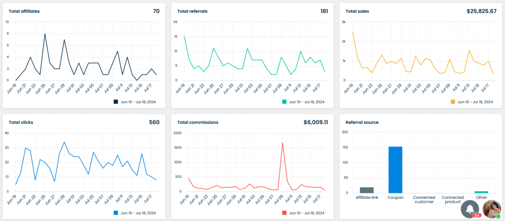
Track performance and optimize your program
To assess each customer’s performance, check the Top Affiliate board on the Dashboard. This report is downloadable in various formats, allowing you to compare it with other affiliate programs or evaluate its impact on your store’s total sales.
5 Best Customer Referral Program Ideas
The best referral program ideas can greatly boost your program’s success. They can be the key to winning or losing.
To help your business succeed, we’ve created this guide.
Here are 5 simple ideas for a successful referral program.
We’ll explain why each idea works, how to implement it, and how to measure success.
Offer double-sided incentives
Some invite-a-friend programs only reward those who refer new customers. This is not a double-sided incentive.
A double-sided program, however, rewards both the customer (referrer) and the new client (referral). The incentives can be the same or slightly different.
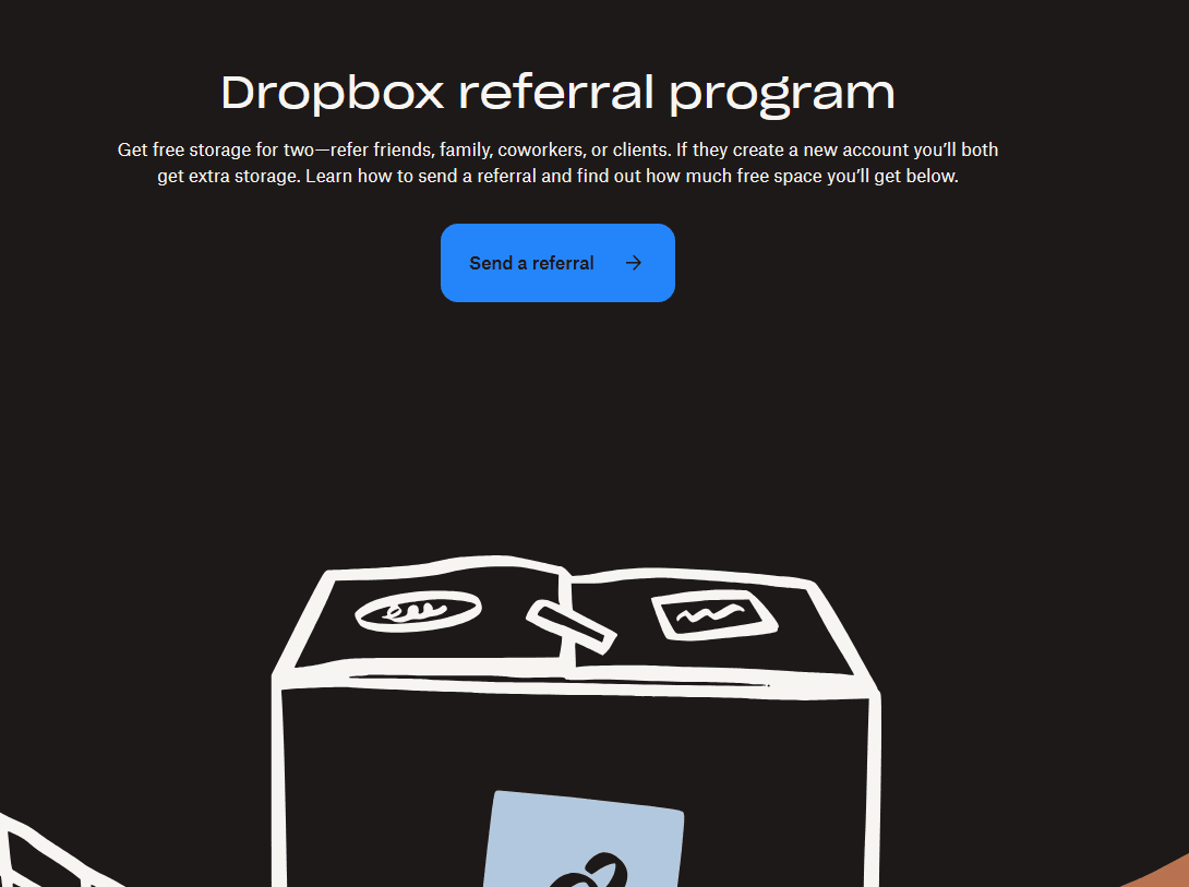
For example, a brand might offer a $10 store credit to the referrer (existing customer) for inviting a friend. The referee (new customer) would then get a 10% discount on their first product purchase.
This approach benefits friends by making them more likely to take advantage of the offer. They feel valued, which makes them more likely to buy.
However, double-sided programs can be costly if not planned carefully. You have two marketing expenses (for the referrer and the referral). This could reduce your profit.
Encourage loyal customers with higher discount
How do you gauge customer loyalty? This is a common question among new business owners. It’s important to be sure of your loyal clients’ loyalty if you want to offer them the best discounts without hurting your profits.
One effective way to measure this is by running a Net Promoter Score (NPS) test. Many businesses use this test to see how customers view their brand.
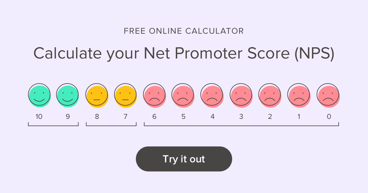
NPS scores categorize customers into promoters, passives, and detractors. Customers who score your business 9 to 10 are promoters. They are loyal, happy, and enthusiastic.
Customers who rate your brand 7 to 8 are passives. They are somewhat satisfied with your business but not enough to be promoters.
Detractors score your business 6 and below. They are unhappy, unlikely to buy again, and may discourage others from trying your products or services.
You can use some platforms, such as SurveyMonkey, Qualtrics, or Promoter.io to run the test.
Running an NPS survey helps you identify your loyal clients. These clients deserve higher discounts, free access to premium services, or other attractive rewards.
Run giveaways/contests
Bonus drawings and contests are among the best referral program ideas. They tap into customers’ natural competitiveness, encouraging them to invite as many friends as possible to win a prize.
Referral contests
A referral contest is like a race. It challenges customers to use their creativity and persuasion skills. The goal is to refer as many new clients as possible within a set time frame. The business then counts the qualified referrals and awards a big-ticket prize to the referrer with the most referrals.
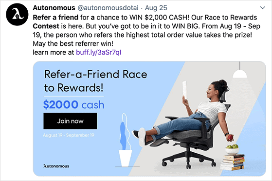
However, it’s essential to reward every qualified referral to keep all participants motivated. If only the top referrer is rewarded, others might not try their best, thinking they have little chance of winning.
Giveaways
Running giveaways can address this issue. It’s similar to a lottery, where everyone has an equal chance of winning. Each qualified referral counts as a raffle entry. Therefore, the more referrals a customer makes, the higher their chances of winning.
For example, you could offer a brand-new Apple MacBook Pro as the jackpot prize. This way, even if customers don’t have the highest number of referrals, they still have a chance to win, keeping them engaged and motivated.
Donate to charity
Many companies find rewarding customers with money for referring new clients not only acceptable but expected.
However, some customers appreciate brands that display social responsibility. This alone can motivate them to help the company gain more customers. They know that a larger customer base enables the business to contribute more to charity.
Studies show that 7 out of 10 consumers value brands that demonstrate social and environmental responsibility. Additionally, 23 out of 50 consumers consider a company’s efforts to address these issues when making buying decisions.
The Harvard Business School reports that people prefer brands that sacrifice more of their revenues for social causes. They view these companies as “more generous” and have a strong sense of goodwill.
For instance, imagine you donate $50 to charity for every qualified referral while a competitor donates $25. Potential clients are likely to choose your brand over the competitor’s.
Market research is crucial. You don’t want to be “too generous” and hurt your bottom line. However, you also can’t afford to be stingy, as this could drive potential new clients to competitors with more generous donations.
VIP early access to new products
Only 1,500 of 30,000 new products launched annually succeed. With a staggering 95% failure rate, it’s surprising why businesses would want to give new product access to customers who refer new clients. You might be better off giving away referral cards and cash.
However, customers love feeling prioritized. They like being the first. Researchers at the Haas School of Business say, “First is best.”
This is why giving customers early access to new products is one of the most effective referral program strategies. It shows that your business values them. They feel like a priority.
If your customers are like this, you can achieve your customer acquisition goals more effortlessly. Early access to new products can drive word-of-mouth referrals and build customer loyalty.
How to Set up a Customer Referral Program with UpPromote?
Looking to boost your customer base and reward loyal clients?
Setting up a customer referral program with UpPromote can help you achieve just that!
Boost your customer base! Reward loyal clients with UpPromote’s referral program.
Let’s take a look at how our customer referral program works:
Widget or landing page display: Once you set up the feature, a “Refer & Earn” widget or landing page (based on your display settings) will appear on your website to prompt customers to register for your referral program.
Referral link: Customers receive a referral link instantly when they fill out their emails and click on the “Get invite link” button.
Discount for friends: Customers’ friends get a discount at checkout automatically when purchasing via the invite link.
Reward notification: An email is sent to customers when their referrals are approved and paid successfully.
Reward redemption: Customers can view their total referrals and commissions and claim their rewards through a portal.
Keep reading to figure out how to set up a program:
Go to Outreach > Affiliate recruitment > Customer referral > click Set up > Switch on the Active box to activate the feature.
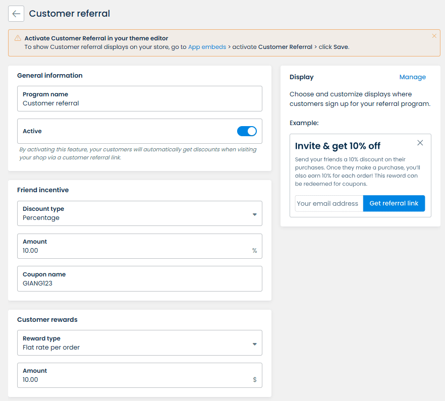
Set up the program name for the Customer referral program.
Choose the type of rewards for your customers: Flat rate per order or Percent of sale.
Set the friend discount: Percentage, Fixed amount, Free shipping, or None.
Protip: Plan your budget carefully when setting double-sided incentives for both the referrer and the referee.
We offer two display options to fit your needs:
- Widget
- Landing page
If you want a simple and interactive way to engage customers, choose the Widget. This floating button on your website catches your attention. When clicked, it opens a popup where customers can quickly register and get their referral link.

If you prefer a dedicated space for sign-ups, go with the Landing Page. This form can be added to any page of your store. It provides a clear area for customers to learn about your referral program, sign up, and get their referral link.
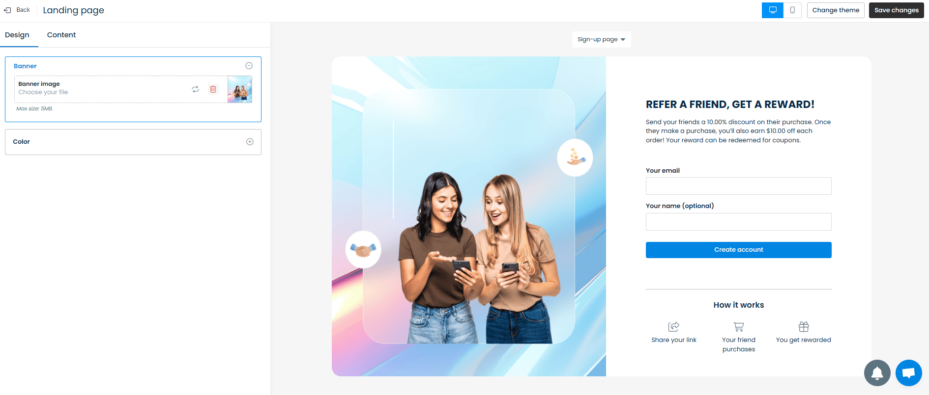
Both options are great since they are:
Customizable: You can adjust the design and text to match your brand.
User-friendly: Both are easy for customers to interact with.
After completing the settings, a program named Customer Referral will be created automatically. You can view it in the Program list from the Programs tab.

Once your program is set up and running, it’s crucial to track its performance to ensure it meets your goals.
In the UpPromote Analytics Dashboard. You can view:
In-depth reports: Visual insights, date filter, and performance metrics (Clicks, Sales, Referrals, Commissions).
Real-time analytics: Track conversions, identify top affiliates, and download reports for comparison.
Using these metrics, users can gain the following insights:
|
Metrics |
Insights you might expect |
|
Visual insights |
Understand overall conversion trends and patterns. |
|
Filter by date and time |
Identify peak referral periods and seasonal trends. |
|
Sales |
Measure the direct impact of referrals on revenue. |
|
Referrals |
Track the success rate of referral conversions. |
|
Top Affiliate |
Recognize and reward top-referring customers. |
Customer Referral Program Examples to Copy
PayPal
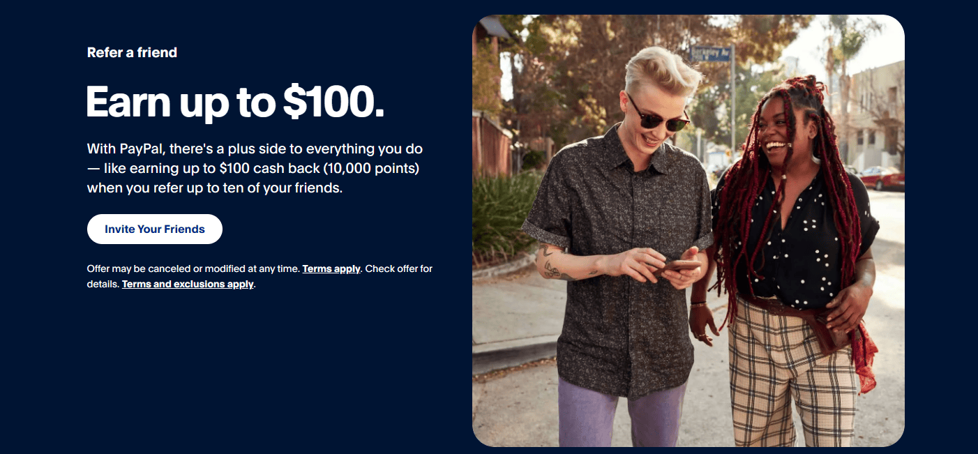
The offer: Earn up to $100 for referring a friend.
PayPal is a pioneer in the referral program space. They were among the first to offer rewards for referring friends. Since PayPal is built on the premise of sending money to friends, it made perfect sense to encourage users to get their friends to sign up.
Today, the PayPal referral program is still going strong, offering a double-sided reward.
When the friend signs up and spends at least 5.00 USD within 30 days, both can earn 1,000 points (redeemable for $10 cash back).
What they do well:
Double-sided reward: Both the referrer and the referee receive 1,000 points.
Concise instructions: Clear and straightforward program guidelines.
Mobile-friendly layout: Easy to use on mobile devices.
Detailed information page: Users can access a separate page for full program details.
Relevant reward: Cashback is an ideal incentive for a money-transfer service.
PayPal’s referral program remains a benchmark for successful referral strategies.
Hiver
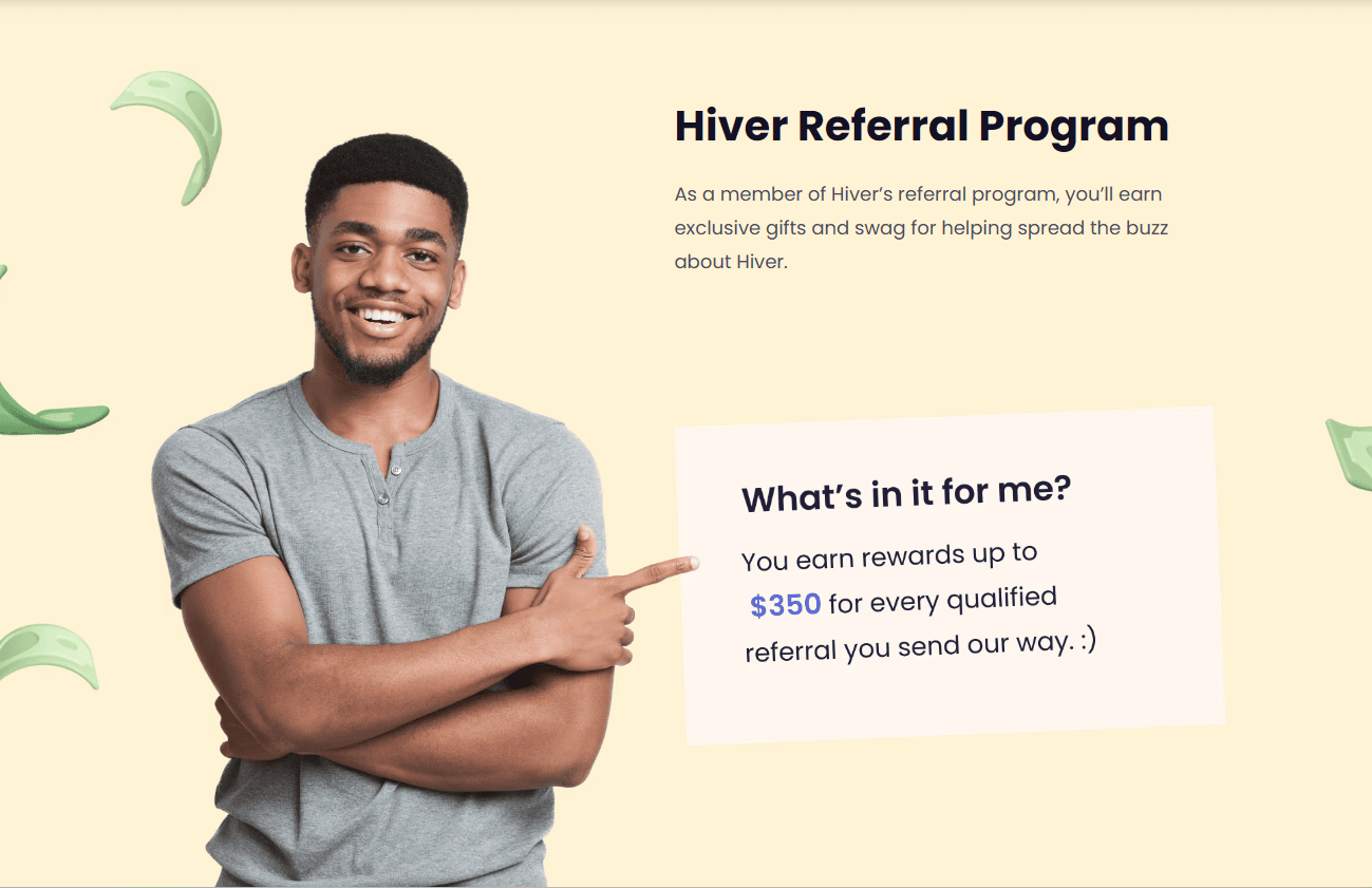
The offer: Earn Up to $350 for Every Qualified Referral
Hiver, a customer support tool that integrates with Gmail, runs a compelling referral program that’s both tiered and stepped. Advocates earn Amazon gift card rewards for qualified referred leads and referrals that result in sales. The milestone rewards are even more enticing, offering:
- A Kindle for three referrals
- A high-caliber evening out for five referrals
- An iPhone for ten referrals
What they do well:
Compelling reward structure: The tiered and milestone rewards are very attractive.
Clear explanation: The “How it works” section simplifies the complex reward structure.
Immediate action: The “Get Rewarded” button is prominently displayed above the fold, allowing loyal customers to start referring right away.
FAQ section: Provide answers to common questions, ensuring clarity.
Hiver’s referral program is a great example of how to structure rewards to motivate and engage customers.
Wrapping up
Customer referrals are a powerful marketing tool that leverages satisfied customers’ trust and recommendations to attract new business. By implementing a strategic referral program with clear goals, enticing incentives, and robust tracking tools like UpPromote, you can significantly boost brand growth and customer loyalty.
UpPromote simplifies setting up and managing referral programs, ensuring seamless tracking and rewarding of referrals. Start leveraging customer referrals today with UpPromote to enhance trust, increase conversions, and grow your customer base effectively.


