When doing affiliate marketing, having a well-optimized landing page is crucial. Without it, you can’t grow your audience and increase sales.
Do you want to make your affiliate marketing shine? Discover our list of top affiliate marketing landing page examples.
These compelling pages will help you to develop your successful ones. Our best practices in the article also contribute to that.
Are you ready to boost your affiliate game? Jump into our content now!
Type of Affiliate Marketing Page & 14 Best Affiliate Marketing Landing Page Examples You Can Follow
In this part, you will go through some types of affiliate marketing pages. Then, explore our list of the top 14 affiliate marketing landing page examples that stand out.
Researching them will help you to know how to create a great one. Let’s check it out!
| Landing page | Type | What To Copy |
| ExpressVPN | Direct sales |
|
| NordVPN | Direct sales |
|
| HubSpot | Direct sales and lead-capturing |
|
| BigCommerce | Lead capturing |
|
| Official Insurance | Lead capturing |
|
| The Affiliate Lab | Direct sales |
|
| Claim Compass | Information-filled |
|
| Landingi | Direct sales |
|
| Ember | Direct sales |
|
| Pipedrive | Direct sales |
|
| Unbounce | Direct sales and lead-capturing |
|
| Allbirds | Direct sales |
|
| Monday.com | Direct sales |
|
| Promo | Direct sales |
|
ExpressVPN
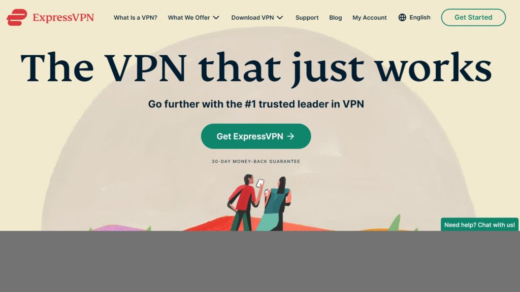
ExpressVPN receives a huge number of total visits each month. According to SimilarWeb, it had around 3.8 million visitors on desktop and mobile last month.
When checking by UberSuggest, the landing page has 66,343 shares on Facebook and 1,441 on Pinterest.
The page is a combination of many great factors that make it work. A simple headline with a subheading contains easy-to-focus keywords like “VPN”, “just works”, or “1”. Moving down, you will see a basic guide with three clear steps for getting started with a VPN.
The brand also includes nine persuasive benefits in the pages. They are best-in-class encryption, 24-hour live chat support, TrustedServer technology, etc.
The page uses lots of subheadings and bolded text to make sure the key points stand out and are easy to spot. CTAs are also put in a suitable and convincing way.
What to copy:
- Build trust on multiple levels
- A simple and strong headline
- Proper distribution of CTAs
NordVPN
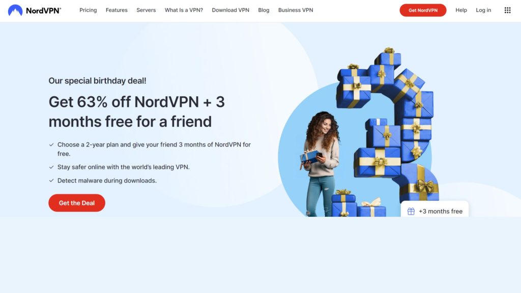
NordVPN is a brand that has a large number of visitors per month. Its number is 16.4 million individuals browsing its website.
NordVPN’s landing page receives 60,444 shares on Facebook and 9,484 on Pinterest.
When visiting the page, the first look of users will be attracted to its headline of promotion – “get 67% off”. The CTA and countdown timer make it more convincing to take action.
The landing page shows NordVPN’s great features and its availability on many devices and browsers.
The brand includes customer and expert reviews in different forms. It also shows the pages it’s featured in and the awards it has. All these things make it trustable.
Ending the page with frequently asked questions to clarify common inquiries is also a nice idea.
What to copy:
- Attractive headline with great promotion
- Put CTA and countdown timer together
- Include experts and customer reviews, featured pages, and awards
- Have frequently asked questions for clarification
HubSpot
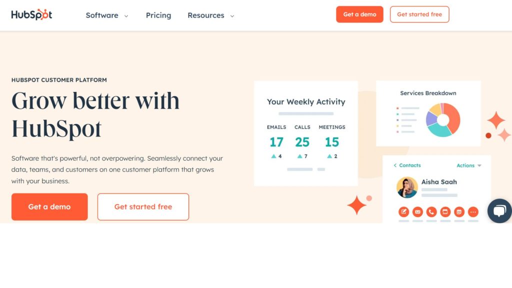
As a well-known brand around the world, HubSpot has an enormous monthly estimated traffic of about 43.5 million visitors.
HubSpot’s landing page is one of the greatest affiliate marketing landing page examples. Let’s browse through it!
The first thing we see is the headline, which looks simple but highlights the brand. Then, the description lets you know what purpose its product is. Two proper call-to-actions urge visitors to check it.
The landing page shows essential details about HubSpot and demonstrates it as a comprehensive solution for businesses. HubSpot’s page contains a substantial amount of information, yet it’s organized effectively to showcase HubSpot’s capabilities.
Colors are harmoniously aligned with the brand and highlight the call-to-action buttons. Free trial buttons appear throughout the page, making people want to try it.
What to copy:
- The arrangement of details about HubSpot
- The use of harmonious colors
- The organization of call-to-actions
BigCommerce
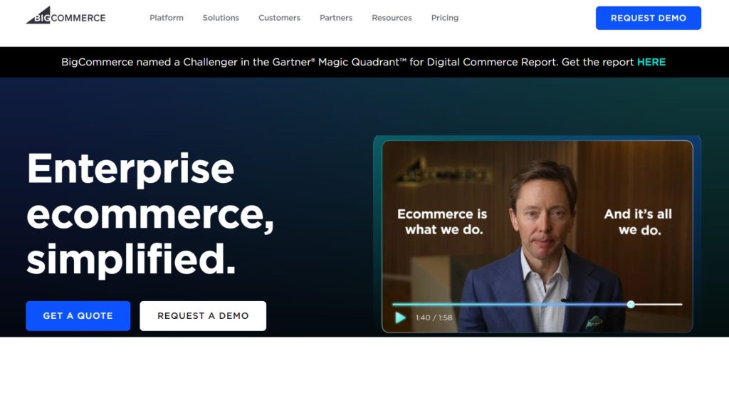
As a shining name in the ecommerce world, BigCommerce has around 5.2 million visitors per month. BigCommerce’s landing page has many great points that we can learn from.
Throughout the page, it uses clear and concise messaging that speaks directly to its audience’s needs. It emphasizes how it should be your choice, though your business is B2B, multi-storefront, omnichannel, etc.
Another advantage of the page is its great visuals. High-quality images and videos contribute to showcasing its benefits.
The landing page also includes reviews from leading brands. That helps enhance its credibility. Examples of customers that are succeeding with its solution add to its persuasiveness.
What to copy:
- Clear and concise messaging
- Great visuals along the page
- Examples of successful cases
Official Insurance
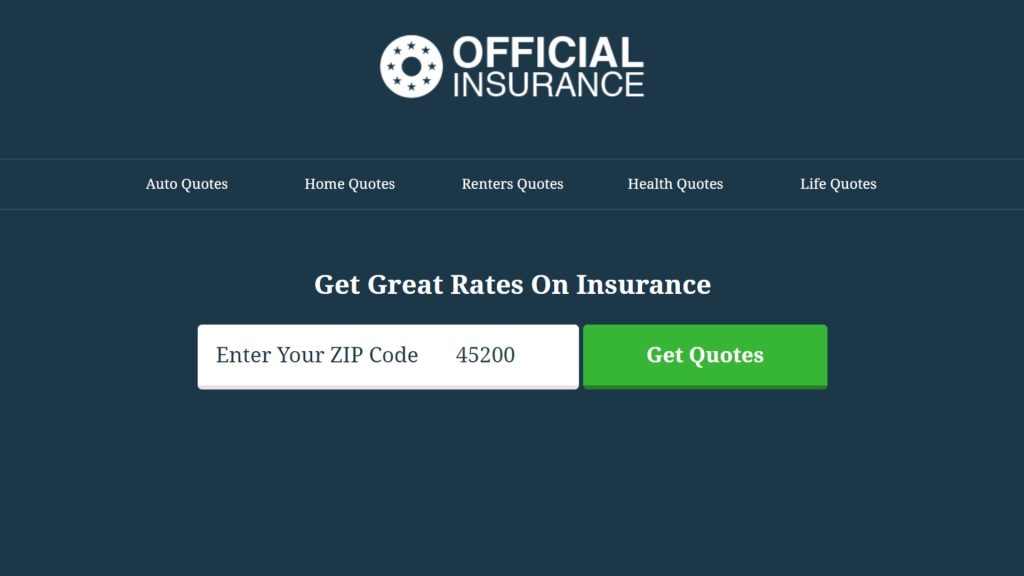
Official Insurance has a total visit of around 277k each month.
It’s actually not a big number compared to some other insurance sites like GEICO or The General Insurance. However, its landing page is one of the best examples of landing pages. There are interesting points for us to learn from the page.
Simplicity is an outstanding feature of the page. Its copy and design are clear and simple, leading the audience to obtain an insurance quote.
It’s just about entering a zip code and clicking the big green button. That simplifies the process, making it fast and user-friendly.
What to copy:
- Clear and simple design
- Direct and effective words
- Straightforward process
The Affiliate Lab
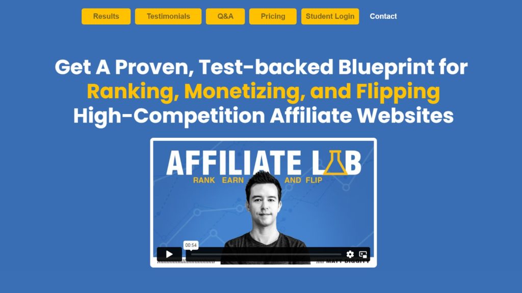
Different from the others, the Affiliate Lab is a page for promoting a course. It’s from Matt Diggity, a person famous for affiliate marketing. The page gets 95.6k visits each month.
When jumping onto the page, you see the great title at first glance. It’s highlighted with appealing words like “ranking”, “monetizing”, and “flipping”. An intro video and an outstanding CTA in red are also located there.
Next is Matt Diggity’s story. The copy is appealing with the story-telling technique, leading users through the page.
The abundance of social proof adds to its convincing power. It also skillfully blends dark and bright colors to emphasize the call-to-action buttons.
What to copy:
- Captivating story-telling copy
- Outstanding CTAs
- Persuasive social proof
Claim Compass
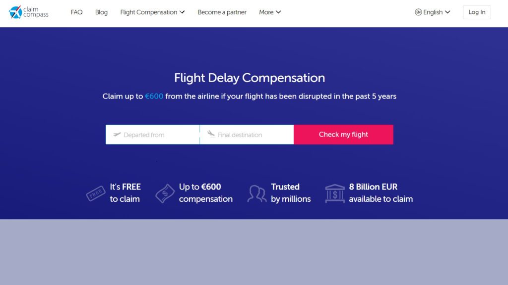
Claim Compass is a site for checking flight delay compensation. It’s clearly displayed in the headline of the page.
Claim Compass receives 131.8k visits per month. With its clean design and clear content, it attracts users to check flights and make claims.
The description below the headline is appealing, with numbers like “up to €600” or “in the past 5 years”. There are also convincing details such as “free to claim”, “trusted by millions”, or “8 billion EUR available”.
The page has a guide showing simple steps to get claims. It also includes customer testimonials, increasing persuasiveness.
The CTAs at the start and end of the page are designed with outstanding color and great copy. “Check my flight” or “Claim my money” pushes users to take action!
What to copy:
- Clear and convincing copy
- Minimal design with exceptional CTAs
- Many testimonials and ratings
Landingi
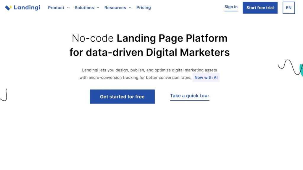
Landingi is a platform for building landing pages without code. Its landing page is also its home page. It has 175k total visits each month and 5,823 shares on Facebook.
When going to see the page, its headline and description appear first, with fundamental information about the product. Two CTAs are suitably arranged, highlighting “Get started for free”.
The page also lets the audience know the benefits of using the platform. It shows credibility by displaying leading brands trusting them and many customer reviews.
The information of its strong infrastructure and wide integrations are skillfully incorporated. At the end of the page, which includes packages, four CTAs “Try it for free” shine and urge users to click on them.
What to copy:
- Include much proof for credibility
- Show clear benefits when using the product
- Suitable CTAs on the page
Ember
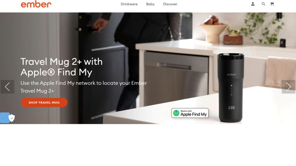
Ember provides drinkware to consumers. It has a total monthly visits of 501k.
The landing page opens with sliders showing different aspects of the products. Each has a unique call to action.
The next parts highlight the perks of their drinkware, with the text emphasizing the different benefits of the products. They also include comments from many consumers as great social proof.
The design is clean and user-friendly. That makes it easy for visitors to navigate and find the information they need without feeling overwhelmed.
Besides, the color choices are minimalist, too. It’s similar to the brand’s logo, so it is reminiscent of the brand.
What to copy:
- Use sliders focusing on products’ benefits
- Express different aspects of products
- Nice and easy-to-navigate
- Color is reminiscent of the brand
Pipedrive
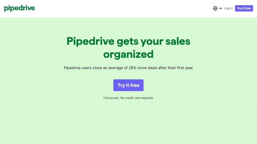
Pipedrive is another great CRM platform that has a large number of visits each month. It receives around 9.3 million visitors per month.
The landing page starts with an outstanding headline showing the platform’s advantages. Also, there’s an appealing call to action there: Try it free!
It builds different content for browsers who have and haven’t used a CRM before. Each has a tab to choose their status and relevant content. That helps to reach the audience well.
Skilfully integrating feedback regarding each feature is a great way to convince customers. Using the CTA “Try it free” below each plan is, too.
Another exceptional point of this landing page is that it includes case studies!
Yes, those are the success stories of businesses that have used Pipedrive’s services, with comments from individuals from such businesses. They help to persuade customers to try.
The page also has frequently asked questions for users. Thanks to that, they can self-resolve some inquiries.
What to copy:
- Different tabs of content aligned with different audiences
- Helpful CTAs contribute to convincing customers
- Include both comments and successful case studies
- Great frequently asked questions section
Unbounce
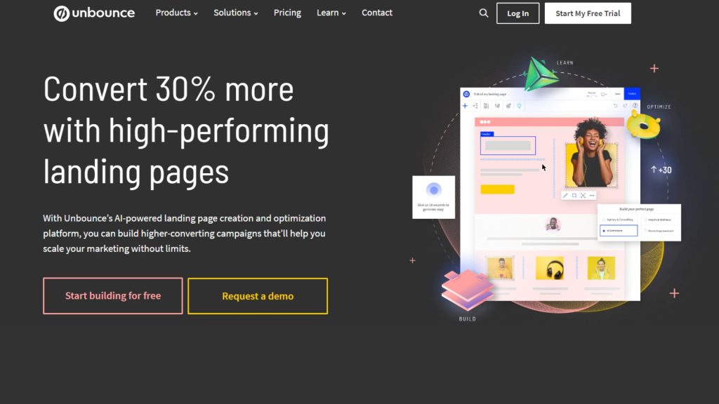
Unbounce is a tool for creating landing pages with AI support. It has 734.3k visits each month.
Unbounce’s landing page starts with a great headline. It focuses on the efficiency of landing pages built by the platform. The adjective “high-performing” and the number of 30% more conversions make it appealing.
The copy emphasizes the special point of Unbounce – making landing pages fast. It highlights the power of AI integration as well. It also shows the platform’s benefits in the page’s sections.
The CTAs appear at the start and the end of the page. They focus on starting free or requesting a demo, encouraging users to take action.
What to copy:
- Headline with strong words and number
- Highlight the special point of its service
- Well-performing CTAs
Allbirds
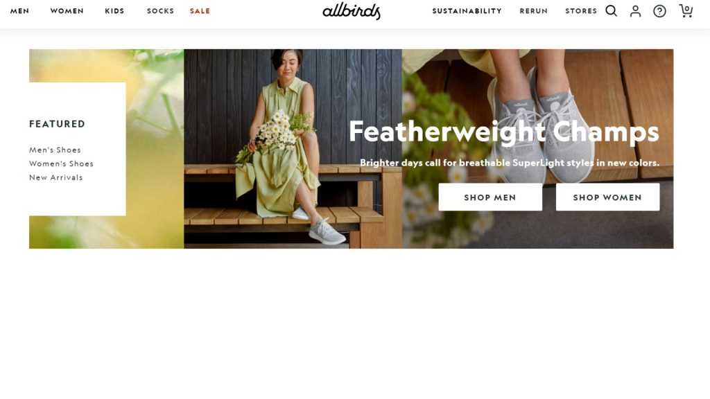
Now, let’s come to the landing page of a shoe brand – Allbirds. Allbirds have been getting 1.3 million visitors per month – a nice number.
Allbird is well-known for its eco-friendly footwear. Its landing page also shows its sustainable branding.
The design is clean and natural. It has some simple images and short words. Its color brings a pleasant and relaxing feeling. The minimalist approach helps focus attention on the products and the brand’s message.
The page has engaging visuals. Great images and videos showcasing the shoes in various settings. They contribute to showcasing products’ unique features, such as comfort and material sourcing.
The landing page features clear and compelling calls to action. They invite visitors to explore their product lines, learn more about the brand’s sustainability strategy, or make a purchase.
The user interface is easy to navigate. It allows visitors to explore different product categories, the brand’s story, and its sustainability initiatives.
What to copy:
- Clean and natural design
- High-quality images and videos
- Easy-to-navigate user interface
- Show the brand’s sustainability
Monday.com
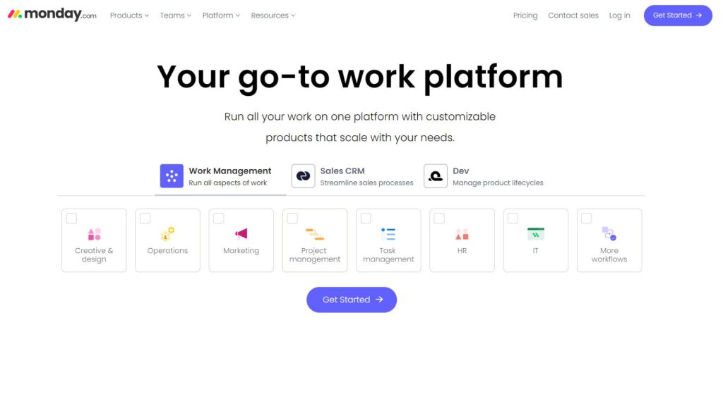
Monday.com has been known for its project management tools. It receives an enormous number of visits each month, up to 32.6 million.
Why does its landing page work and convert many customers?
Monday.com’s landing page presents a clear and compelling value proposition. It quickly informs visitors how they can benefit from using the platform.
The design is intuitive and user-friendly. It has a clean layout that guides visitors through the features and benefits of the platform. It doesn’t overwhelm them with too much information at once.
The brand also put engaging visuals and demonstrations on the page. They include screenshots of the platform in action. That helps potential customers to know how Monday.com works and how it can be applied to their own work processes.
Monday.com enhances persuasiveness by adding social proof. It includes testimonials from different businesses and a link to case studies.
What to copy:
- Showcase compelling value proposition
- Have an intuitive landing page design
- Use screenshots to show the platform in action
- Social proof includes testimonials and case studies
Promo
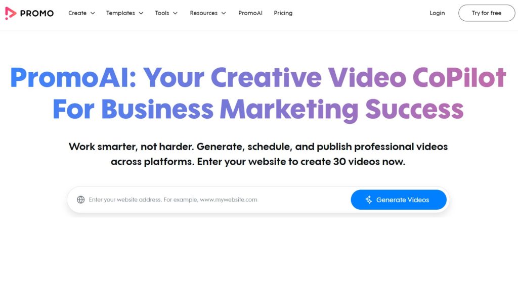
Promo is known for creating videos easily and quickly. It has 381.4k visits per month. Though its team only has 54 persons, Promo’s revenue is $5.8 million in 2023.
As it specializes in video content, the landing page showcases engaging visual content. For instance, it includes templates created using the platform to demonstrate its capabilities and inspire visitors.
The page shows the benefits of Promo, such as making videos fast and smart, saving time and money, etc. The CTAs are also flexibly used to attract people to go to the next steps.
It includes a free trial, allowing potential customers to experience the platform’s features. That helps to reduce barriers to entry.
The landing page also features reviews from satisfied customers, highlighting how Promo has helped them. The section assists in building trust and credibility.
What to copy:
- Demonstrate its capabilities by engaging templates
- Showcase benefits together with CTAs
- Features reviews from customers
What is an Affiliate Landing Page?
An affiliate landing page is a specialized web page designed for marketing campaigns.
The page only focuses on encouraging visitors to take a specific action. The action can be making a purchase, registering a form, or downloading an app.
It’s different from other pages that may have many purposes, like informing, entertaining, or serving many objectives.
The main goal of an affiliate landing page is to transform visitors into leads or buyers.
So, the design of the page is to persuade visitors of the value of the offer. It can use compelling content and strong call-to-actions (CTAs).
The page aims to simplify users’ experience and lessen distractions. This approach guides them toward conversions.
An affiliate landing page should be optimized for many sources of traffic. This includes organic search results, email marketing, paid advertising campaigns, and social media platforms. Tailoring the page to accommodate traffic from these diverse sources will help you to maximize its effectiveness.
Why are Landing Pages Crucial for Affiliate Marketing?
Direct conversion focus
Landing pages are crafted with a single goal – to convert visitors. This direct approach is crucial in affiliate marketing as it helps to bring higher conversion rates.
Unlike a typical website page, landing pages have no navigation menus or unrelated information. They make extra things disappear, just what customers need to see. That helps to minimize distractions and focus the visitor’s attention on the offer.
With focused CTAs, landing pages effectively guide visitors toward taking the desired action. Such an action can be signing up, making a purchase, or another goal.
This straightforward approach helps turn visitors into buyers or subscribers much faster. In other words, it helps you get more achievements in affiliate marketing.
Effective with multiple traffic sources
One of the outstanding advantages is that landing pages work well with various traffic sources. No matter where your visitors come from, they perform the same duty.
Thanks to the landing page, you can be free to reach your target audience and get traffic from any suitable platform. It can be Google searches, paid ads, social media, or email address campaigns.
This versatility makes landing pages a powerful part of any affiliate marketer’s toolkit. They ensure your performance, regardless of how your audience finds you.
Performance tracking
With landing pages, affiliate marketers can track how well they perform. It also reflects the performance of your affiliate marketing campaigns.
Key metrics like total visits, clicks on affiliate links, or conversion rates give you valuable insights. Such data helps in making informed decisions to improve marketing strategies.
Moreover, landing pages are ideal for A/B testing. That means you can compare different versions of headlines, calls-to-action (CTAs), and images to see what works best.
This ongoing testing and optimization process is crucial for refining strategies and boosting conversion rates over time.
Credibility increase
Well-crafted landing pages boost your offer’s credibility, making it more appealing to visitors. A professional page brings trustworthy feelings to visitors. This increased trust enhances promising leads and sales.
Create a Killer Affiliate Marketing Landing Page in 9 steps
Select a suitable landing page builder
To make an effective affiliate marketing landing page, start by picking the best page builder.
You need something that lets you add cool pictures, banners for your affiliate products, and headings that grab people’s attention. These details help show off what’s great about the product you’re promoting and make visitors want to buy or sign up.
Your landing page also needs to look good and have the right parts, like catchy titles and proof that other people love the product. That’s why choosing a builder that’s easy to use is important. Look for one with a simple drag-and-drop feature and lots of design options. This way, you can make awesome landing pages that get people excited and more likely to take action.
For instance, you can use Elementor as a plugin if you build your site on WordPress. Or you can try independent builders like Leadpages.
Build out a wireframe
Before you start writing the words for your page, it’s useful to draw a simple plan or wireframe.
It serves as the basic outline of your page. It shows where everything goes, how people will move through the page, and what actions you want them to take.
You can simply do it by sketching on paper. Otherwise, you can also try online tools like Figma or Sketch. They’re easy to use and don’t cost much.
This step helps you structure your thoughts and plan a page that guides visitors exactly where you want them to go.
Create a grab-attention headline
Of course, the headline on your landing page is crucial. It’s the first thing visitors see, and you have just a few seconds to grab their interest.
A powerful headline should be short and engaging. It should make the value of your offer crystal clear. It’s about creating a mix of urgency, excitement, and clear benefits that sets your product apart from the rest.
Your goal? To catch the reader’s eye and encourage them to stick around, eager to find out more. This is your chance to convince them they’re in the right place.
Make sure your headline is compelling enough to prevent them from leaving. Also, make them interested enough to move toward your call-to-action (CTA).
A strong headline is more than an introduction. It’s an essential moment that can decide the success of your landing page.
Include captivating visuals
A high-converting landing page can’t lack attractive visuals. They help to enhance engagement and conversions.
Did you know our brains love looking at pictures and can understand them super fast, much quicker than reading words?
The difference in the speed of processing visuals compared to text is 60,000 times. That means people are more likely to get interested and understand what you’re selling when you use visuals.
You can use pictures or infographics to show your product or service and its benefits. You can also share images of happy customers to make the page more persuasive. Using drawings to point out how to use the product right is another nice idea.
However, remember that heavy pictures can slow your site down. So, make sure to resize them with free tools like TinyJPG or TinyPNG before uploading them to the website.
Have a simple and user-friendly design
When making your landing page, think about keeping everything simple and easy to use. Simplicity enhances user experience and focuses attention on your call-to-action (CTA).
You should use easy-to-read fonts and colors that match your brand but don’t make things hard to see. Try to make the page intuitive so that visitors can easily navigate. You may also use proper white space to make a clean look, helping your headline and CTA stand out.
Besides, don’t forget to implement a responsive design. That’s important for the page to look great and function well on all devices.
The last point is to check your page’s usability regularly to ensure everything works. This way, you can fix any issues timely to provide a smooth user experience.
Make your copy persuasive and concise
The next step is to keep your visitors hooked with your words. Your copy should resonate with your audience and guide them toward your CTA. The language used should be simple and clear.
The copy will be all about showing them you’ve got the perfect solution to their problem. Remember, your audience isn’t just looking for any product. They want the best answer to their needs.
Keep your writing focused and genuine. Avoid trying to impress with overly complex words or explanations. Help your visitors picture the better life they could have with what you’re offering.
You should stick to one idea at a time to avoid confusion. Also, be honest and straightforward about what you’re offering and why it matters. And remember this technique: show, don’t tell.
Provide social proof
People often value what others say about a product or service, especially if it comes from a trusted source. This is why including social proof like testimonials, reviews, or endorsements on your landing page can be incredibly persuasive.
In affiliate marketing, that’s even more important. Showcasing a variety of social proofs can significantly influence your audience’s buying decisions.
Testimonials, for example, are a powerful way to demonstrate how others have found value in what you’re promoting.
You can also leverage metrics and statistics to show popularity or effectiveness. Using before and after photos to visually demonstrate impact is also a frequently used idea. Other suggestions include detailed case studies or positive social media feedback.
It’s essential not just to tell your readers about the benefits but to show them real examples of people who have already benefited. This approach helps prove that your product or service has been tried and tested. It makes your offer much more compelling and trustworthy.
Make a clear and compelling call to action
Your call to action (CTA) is the final push encouraging visitors to take the action you want. It can be making a purchase, signing up for more information, or downloading a guide.
No matter what the action is, make sure your CTA stands out. Use direct and action-oriented language for it, like “Buy Now”, “Sign Up Free” or “Get Your Guide”.
You should also make the button visually distinct. For instance, use a color that pops against your page’s background. The design of your CTA also contributes significantly to drawing attention and guiding users toward taking action.
Publish – monitor – optimize
After finishing all factors, it’s time to publish your landing page.
However, the work doesn’t end there! You will need to actively monitor how it performs.
Use tools or platforms like Google Analytics to track important metrics like visitor numbers, conversion rates, and how long people stay on the page.
With the data collected, you can understand what works and what doesn’t. Analyze these and optimize your page.
Remember, optimization is an ongoing process. Continuously refining your page ensures it stays effective over time. That’s to keep your conversions high and your audience engaged.
Conclusion
Now, you should understand the role of landing pages in affiliate marketing. We have also gone through outstanding affiliate marketing landing page examples and a step-by-step guide to building a great landing page.
With such knowledge, you can start making a landing page for your affiliate marketing work. Potential affiliates, you can also leverage landing pages to get good results when joining affiliate programs.
So, don’t hesitate! Let’s start making a landing page today!


