Shopify traffic is detrimental to the growth of any online store.
This refers to the amount of individuals visiting your online store. Shopify traffic is directly proportional to sales and conversions; and also helps to increase brand awareness and engagement.
You may have a good-looking store with all the engaging upsell apps, but it won’t slowly build traffic overnight. Some effort needs to go behind building online traffic.
It’s imperative, therefore, that Shopify store owners spend some time and effort driving traffic to their stores.
This guide will go through the various ways on how to drive traffic to Shopify store.
How to Measure Shopify Traffic?
You might be getting traffic already. So, how would you know?
There are various ways to measure traffic to your Shopify store. The two common methods include:
-
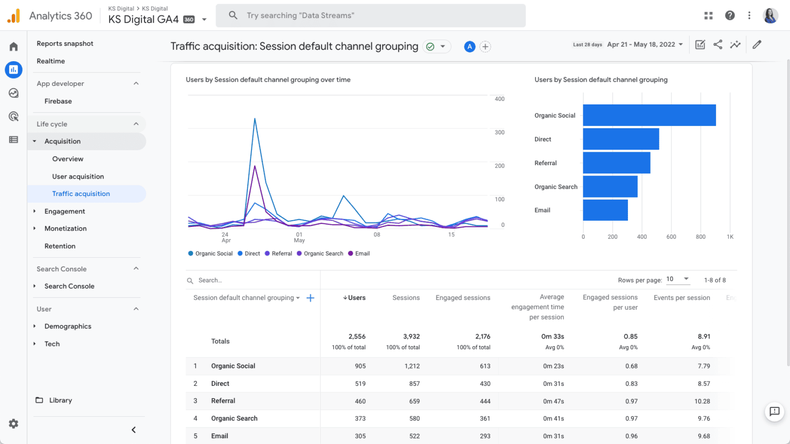
Use Shopify Analytics. You may use Shopify Analytics to view your site’s traffic over time. From the main Shopify dashboard, click on the “Analytics” tab.
-
Use Google Analytics. Google Analytics offers more specific metrics, such as which specific pages are being accessed, where traffic is coming from, and which relevant keywords you’re ranking for, among others. It’s a more advanced monitoring solution for your Shopify store, one you’ll need to implement ASAP if you wish to be hands-on with your traffic-driving efforts.
Make sure to set up Google Analytics before running traffic campaigns. This is so that you’ll have a proper historical view of how your store performs throughout your traffic-driving efforts.
Types of Shopify Traffic
There are two types of Shopify traffic that we want to focus on — organic traffic and paid traffic. Both are necessary for a complete and holistic traffic campaign.
Organic Traffic
Organic traffic is acquired traffic that the Shopify merchant didn’t directly pay for. Organic traffic results from SEO, content marketing efforts, and we’d even say brand awareness campaigns.
Some consider organic traffic as “free traffic.”
We’d argue that acquiring organic traffic isn’t entirely free. Efforts and resources are still needed to obtain organic traffic, such as building a blog and search-optimizing the Shopify website.
The magic lies in how efficient an organic traffic effort can be when handled by an expert. Perhaps a blog that costs $1000 in labor expenses to build results in $10,000 worth of traffic.
However, the reverse also applies. When not handled properly, organic traffic efforts could be more costly than just straight-up burning money.
Paid Traffic
Paid traffic, on the other hand, is traffic that you pay to acquire. This includes pay-per-click (PPC) ads, Google ads, social media ads (e.g., Meta’s Traffic Campaign), affiliate marketing, and even traditional marketing.
This type of traffic is usually proportional to the budget you put into it, making paid traffic generally more predictable than organic traffic.
However, paid traffic efforts may not be as lasting as organic traffic efforts.
For example, when you pay for a social media ad, that ad will only be around until the campaign ends. The same goes for Google Ads and billboard placements.
But if you have a blog that ranks #1 on Google search results, that blog will be there indefinitely. The blog won’t go away unless you take it down. Even if it gets outranked, it will still be up and active on the vast internet.
Paid traffic and organic traffic each have their own sets of pros and cons. Combining the two traffic types makes for a truly holistic traffic campaign, crucial to getting loads of quality traffic,
How to Acquire Organic Traffic
Typical organic traffic methods include SEO, content marketing (i.e., a blog), backlinks, organic social posts, and local directories.
How to get free traffic to my Shopify store
Organic traffic is free, in the sense that no money goes into ad spend. The steps below outline and dissect how Shopify merchants can get “free Shopify traffic” to their stores.
Search Engine Optimization (SEO)
SEO involves adjusting your Shopify store to make it more visible on search results pages (SERPs).
These changes range from improving the customer site experience to improving the security of your site.
Additionally, leveraging tools for content creation and optimization can significantly enhance SEO performance. One method is the use of a Paraphrasing tool. It helps generate unique, high-quality content efficiently, which boosts your site’s ranking and engagement without the hassle of signing up.
How to Search-Optimize your Shopify Store
Here are some crucial SEO tips every Shopify merchant must follow to have a site that Google loves.
-
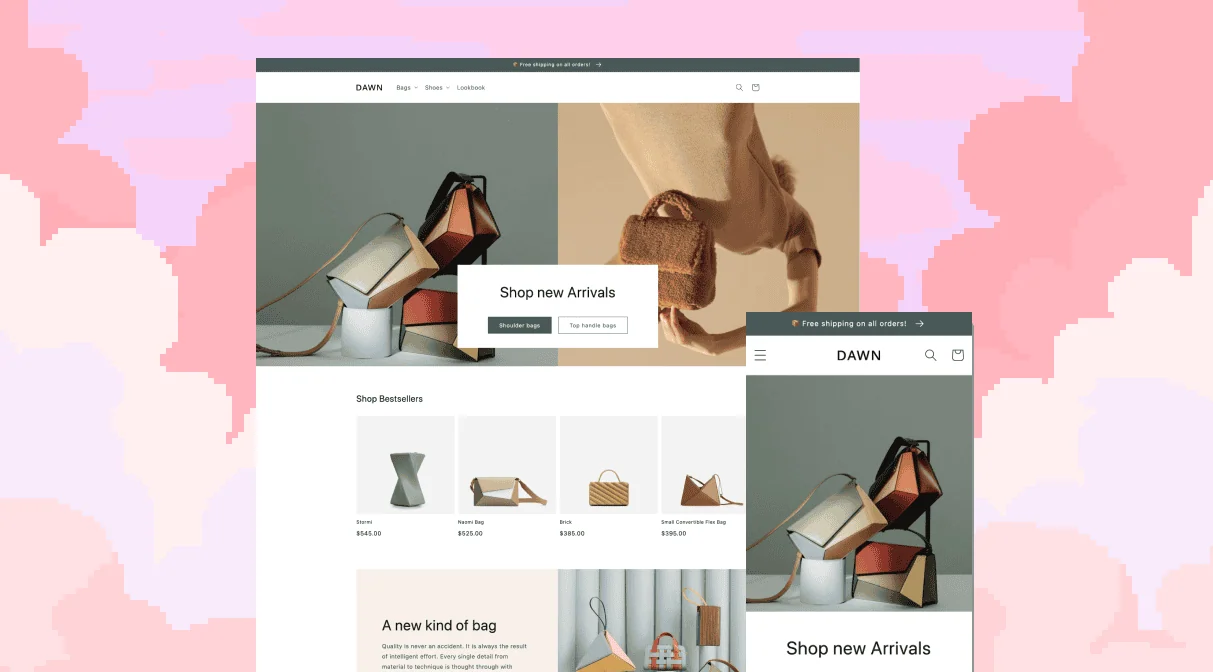
Use a Reliable Shopify Theme. Search engines assess load time to rank pages on the SERPs, so make sure your site is in good working condition with a proper Shopify theme. A speedy and trustworthy Shopify theme minimizes cluttered code and HTML requests, allowing for a clean and quick user experience. There are a ton of reliable and free Shopify themes on the Shopify theme store to choose from.
-
Compress Your Images and Videos. Smaller file sizes allow faster load speeds. Compressing your media files with image compressors, such as Photoshop and Optimizilla, preserves their quality with the added benefit of the site loading much snappier. Also, use JPG files for your website’s photos. Only use PNG if you need transparency — so, for icons.
-
Give Your Images Alt-Text. Alt-text describes through text what’s on the image. These tell search engines what the images are, allowing your site to rank and earn traffic through Google Images.
-
Don’t Stuff Keywords. Google and other search engines have evolved to be smarter in the last three decades. Exact keyword matches and keyword stuffing are a thing of the past. Search engines will penalize any attempt to fool the algorithm through this readability-ruining tactic.
Getting an SSL certificate is also necessary for SEO, but Shopify already provides its users with a free one.
This means your Shopify store is guaranteed an “https://” connection, securing your potential customers’ data and improving your SEO. A Shopify review should provide more insight into Shopify’s unique eCommerce benefits.
Remember, the higher your store’s pages rank on the SERPs, the more traffic they’ll get.
Starting a Blog
A blog is one of the most common ways merchants can venture into content marketing.
It expands the number of search queries a website can rank for, allowing it to be seen for queries such as “How to take care of white shoes” or “Is wearing skinny jeans healthy?”
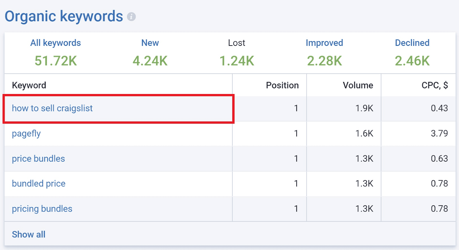
Notice how, in addition to ranking for its own brand name, PageFly also ranks for “how to sell craigslist,” thus, expanding its reach and services to professionals who want to sell on Craigslist.
Apart from additional traffic sources, this also establishes the brand as a thought leader within its niche. We’ll discuss other benefits of starting in this blog throughout this guide.
How to Start a Blog for Your Shopify Site
Here’s the step-by-step guide to starting a traffic-driving blog for your Shopify website.
Step#1: Do Keyword Research
While it can be liberating and relaxing to write about what your heart desires, passion writing may not necessarily give you the traffic you need.
Instead, write topics that will rank for commonly searched queries relevant to your desired online shoppers.
First, decide if you want to aim to rank for long-tail (less competitive) keywords or short-tail (more competitive) keywords. For Shopify stores that are still building their SEO, we suggest writing for less competitive, long-tail keywords.
These are more niche, and therefore, more high-intent but also much easier to rank for.
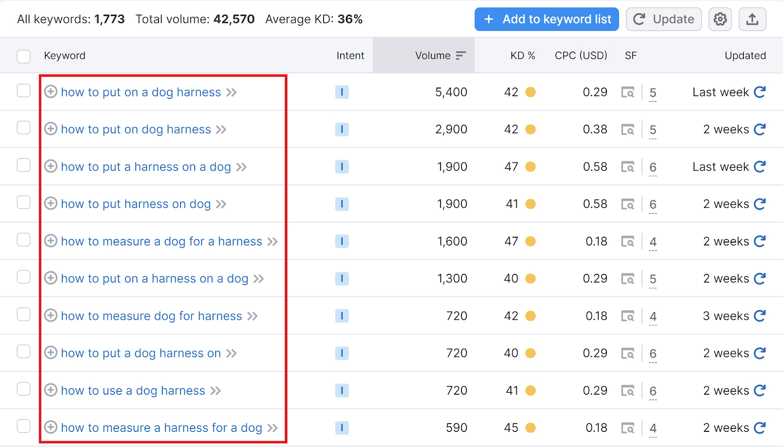
You may use keyword research tools, such as Ahrefs and Semrush to decide on your keywords. Shown above are results for “how to” and “dog harness.”
Compile your relevant keywords in a list and make sure to write quality articles for each of these topics.
Step#2: Acquire The Help of Writers and Editors
As a Shopify merchant, other things call your attention, such as managing inventory. You may want to hire people to write topics for you. Make sure they know their way around SEO writing.
Step#3: Publishing on Shopify
Publishing blogs on Shopify is a much different process from publishing blogs on WordPress.
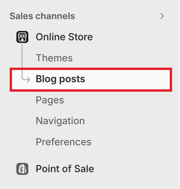
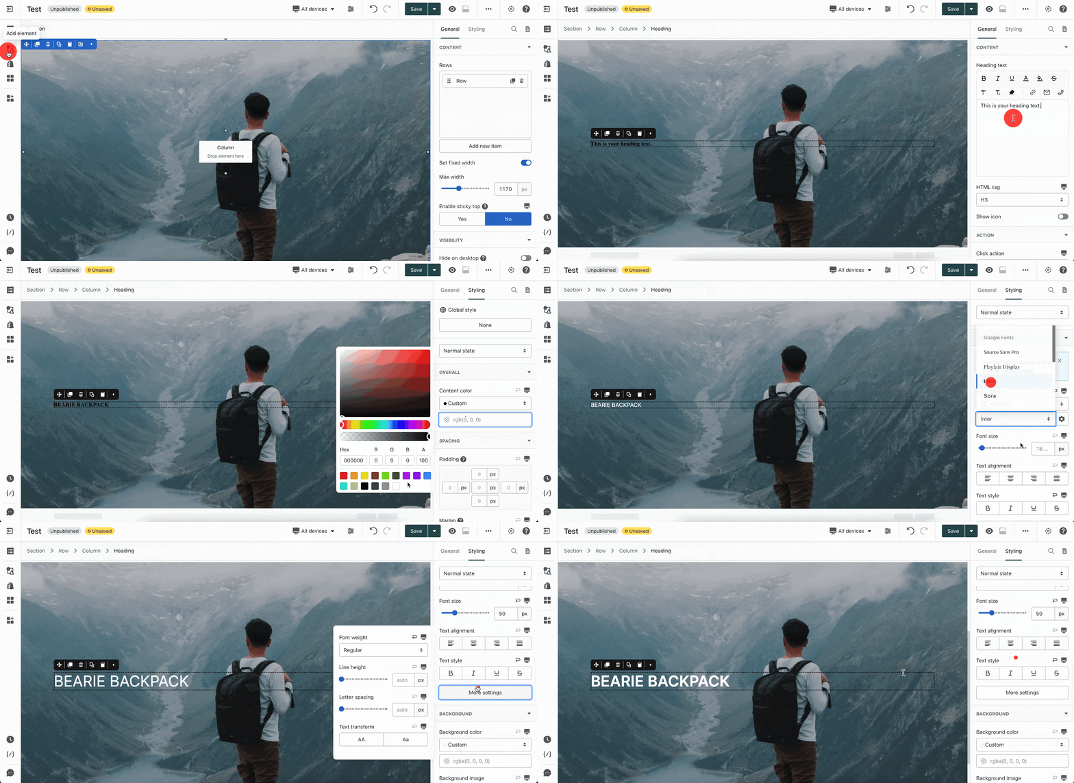
To do that, click on “Online Store” from the main panel and then select “Blog posts.”
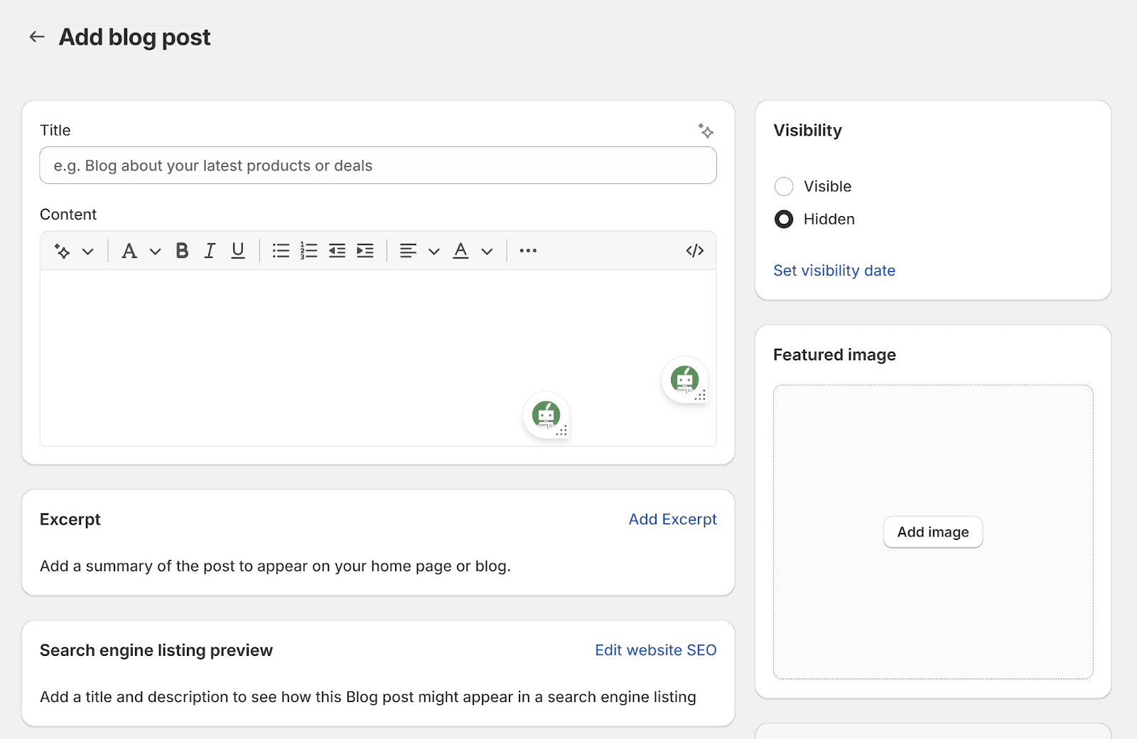
Click “Add Blog Post.” You’ll be taken to the blog post creation suite.
Add a title.
Write your blog post and use the proper headings.
Make sure the visibility is set to “Visible.”
Add a feature image
Click on “Edit Website SEO” to add a title tag and meta description.
Finalize by clicking “Save.”
If you want to make your blog accessible from the homepage, edit the menu that you use for your site’s header.
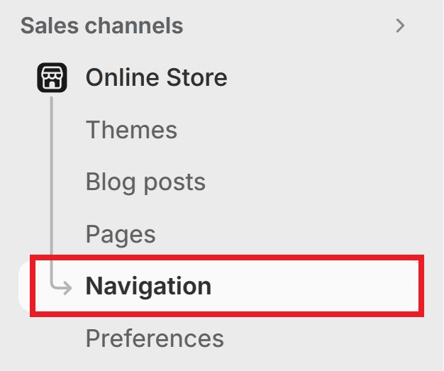
To do that, click on “Navigation” underneath “Online Store.”
In the “Menus” section, select the Menu you’re using for the store’s header.
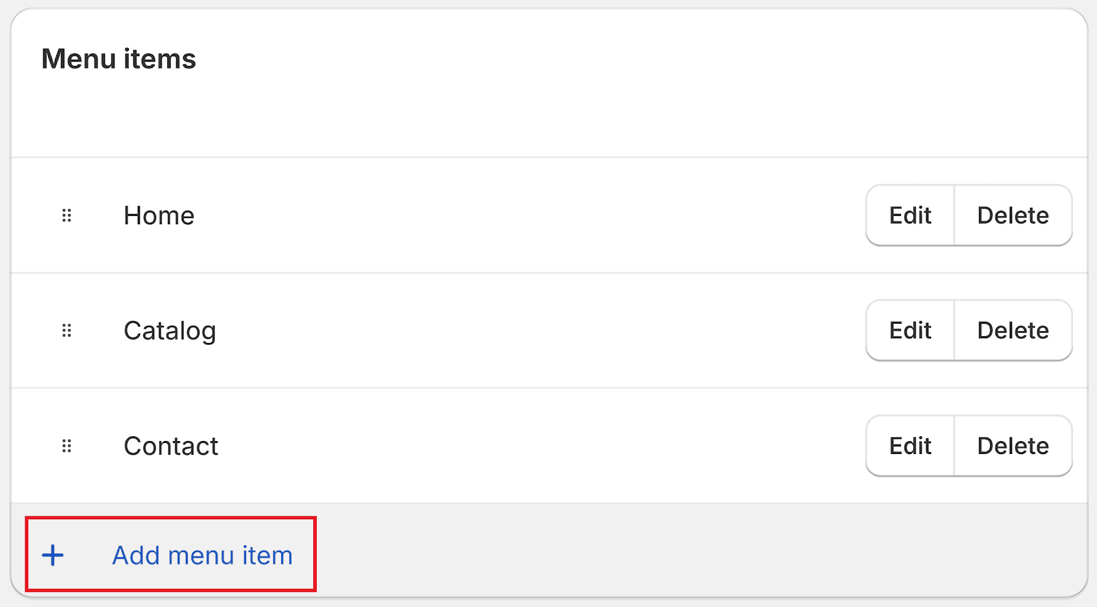
Click on “+ Add Menu Item”
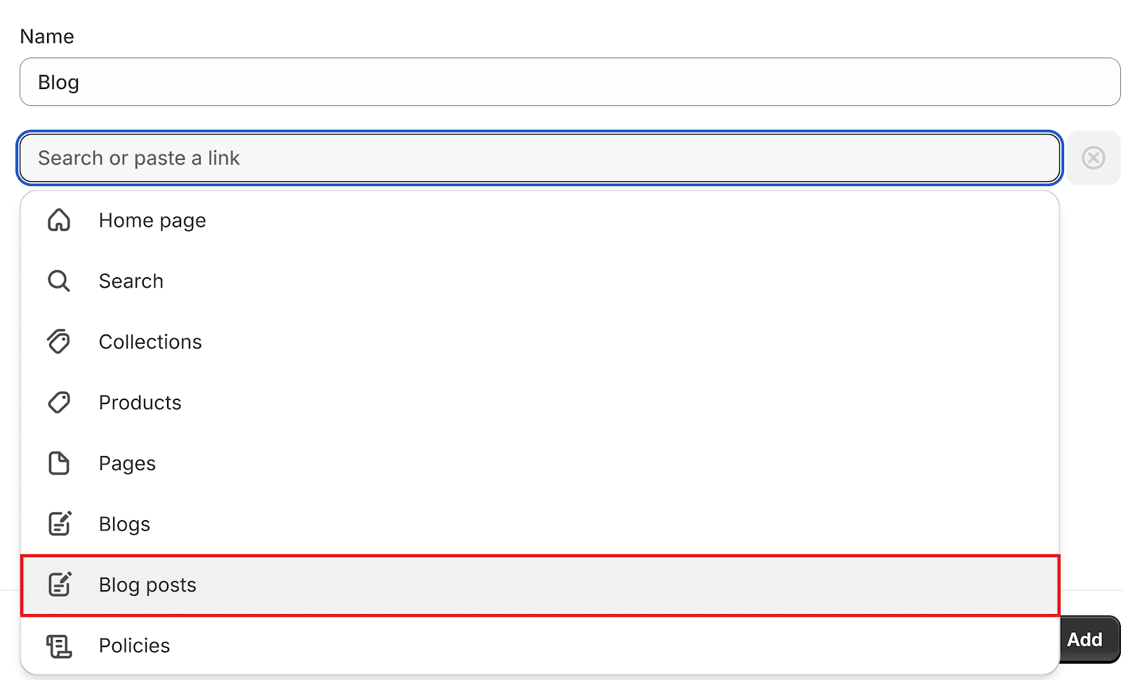
Name it “Blog” then select “Blogs” for the link.
Click “Add.”
Great! A Blog section is now added to your homepage’s header. Site visitors may now easily access your blog regardless of where they are on the site.
Blog-writing Tips
Here are some critical tips to remember when writing blogs. These can improve your authority when it comes to publishing on your chosen subject matter.
-
Write conversationally. Conversational writing keeps people reading, and hence, staying on the page longer. This translates to better click-throughs on CTAs and longer session times.
-
Add images to your blogs. Keep people hooked with supplementary images. Images keep people engaged with the blog, as well as effectively communicate complex ideas.
-
Check your grammar and spelling. Nothing loses authority more than using the wrong “your”. Make sure your writing is befitting for an authoritative and reliable service provider — with perfect grammar and spelling. When in doubt, use grammar-checking tools like Grammarly and Quillbot.
Improving Your Product Pages’ Search Visibility
People also perform transactional searches, such as “Buy wireless mouse,” or “Flavored chicken skin.” Things of that nature.
These search queries are known as transactional queries.
They aren’t concerned with learning how to fly a kite or power washing a carpet. They want to buy a product then and there.
So, make sure your product pages are optimized for the relevant search queries.
How to Search-Optimize Your Product Pages
Here are some quick tips for optimizing your product pages.
Tip#1: Be Descriptive with the Product Description
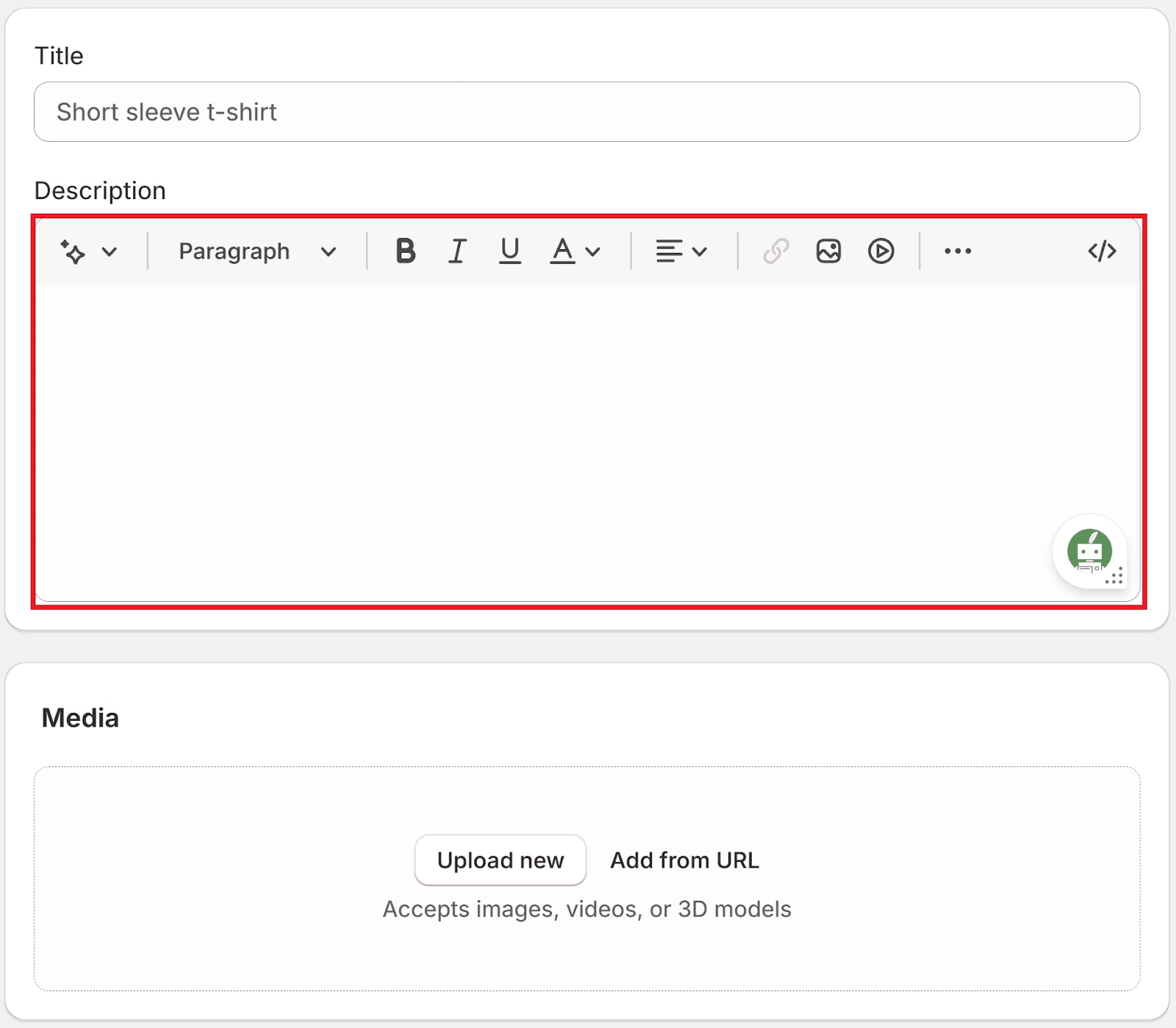
In the Shopify “Products” section, make sure to provide all necessary and relevant descriptions. Include the product’s material, construction, size and dimensions, weight, and things of that nature.
But also add the value it provides to the customer. Will it help them sleep better at night? Will it help them improve at golf? Make sure to add these to the description.
Tip#2: Provide as Much Media as Possible
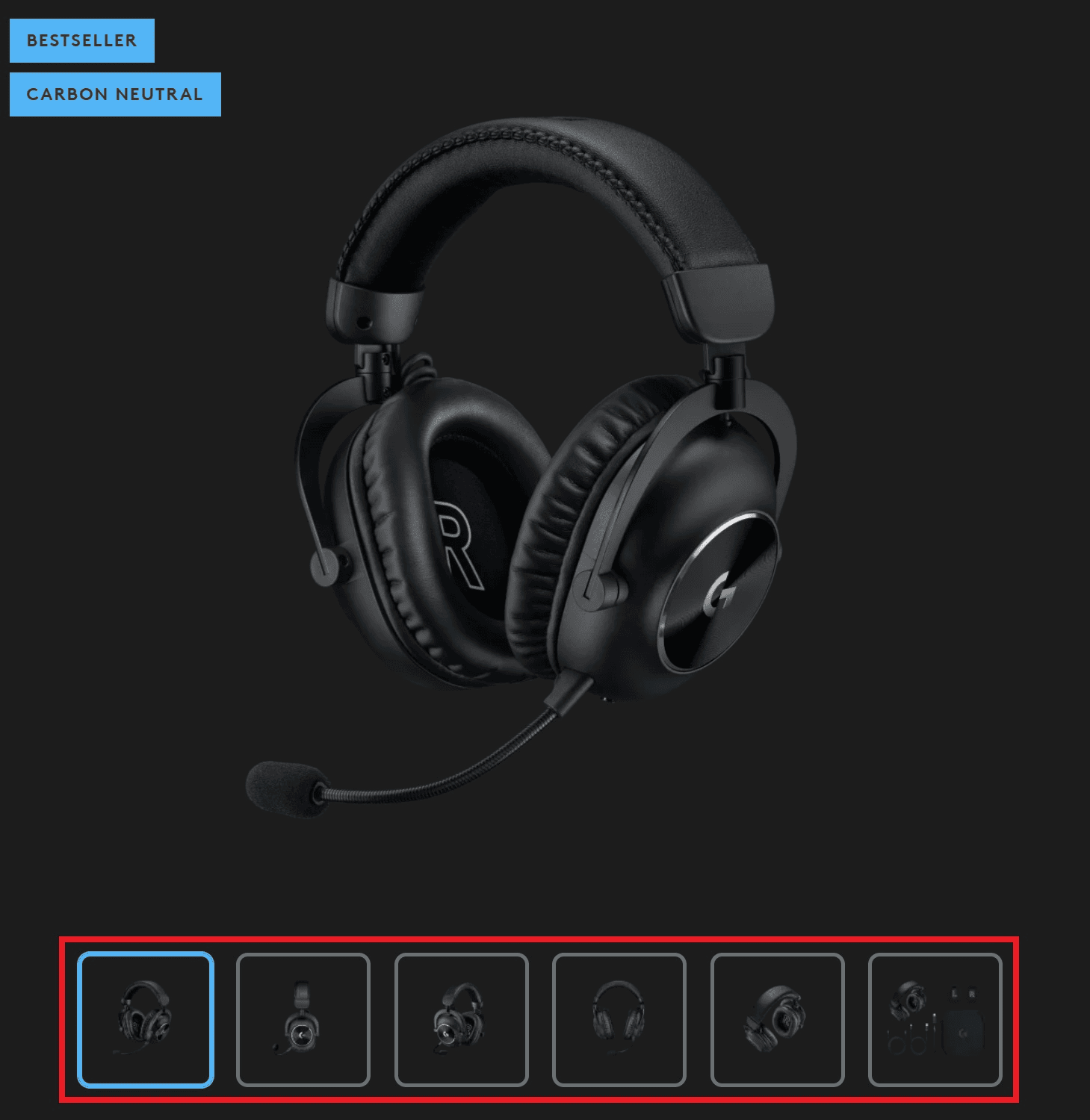
Providing as much media as possible will give potential customers a better idea of what the product is like. From an SEO standpoint, it will also help your product page rank on Google Photos and possibly appear on featured snippets.
Tip#3: Use a Drag-and-Drop Page Builder like PageFly
Drag-and-drop page builders elevate product pages to their maximum potential.
Shopify merchants can create and customize their own product pages, allowing them to highlight various value propositions as they see fit.
PageFly is one such page-builder. It provides all Shopify users with a free section they can use to spice up their product pages. This one free section offering makes PageFly an excellent choice for a one product Shopify store.
You don’t need to have an arsenal of paid themes or coding experience to create compelling, stand-out product pages.
Building Backlinks from Reputable Sites
Backlinks are links from third-party sites that lead to yours.
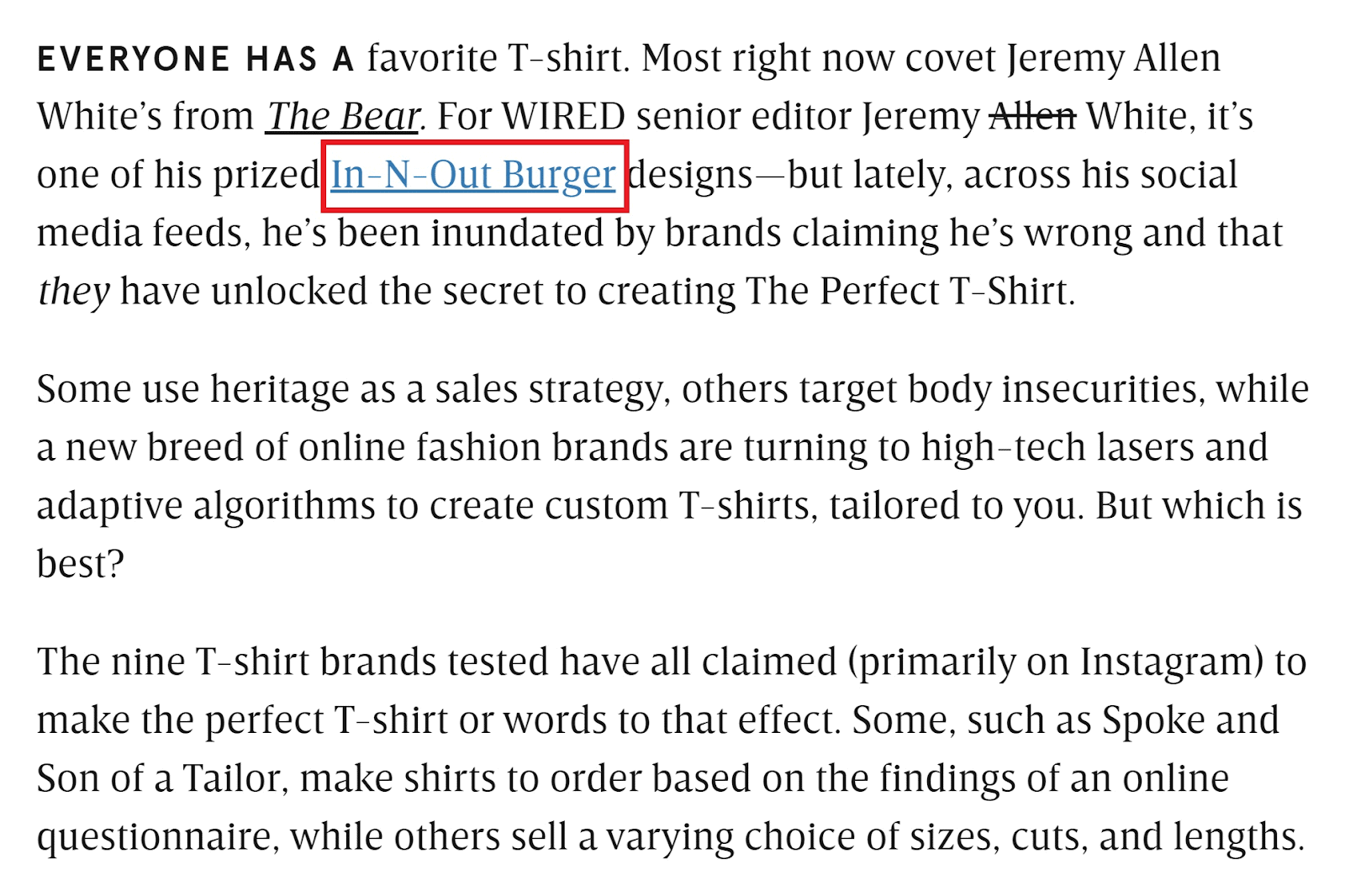
Shown below is a Wired article snippet that leads to In-N-Out’s Shopify store.
Backlinks are an additional source of traffic since they drive site visitors from another site to your Shopify website.
In addition, these backlinks also build up a Shopify store’s domain rating.
A domain rating is a 100-point measure of how reliable and authoritative a site is. The number and quality of do-follow backlinks are a crucial indicator of a good domain rating.
For reference, Hubspot has a domain rating of 93.
New York Times, 94;
and In-N-Out’s online shop has a 75.
A higher domain rating means a more authoritative brand, which, in turn, means a higher ranking on SERPs.
Here’s how you can build backlinks to your Shopify store. Do note, a blog will come in handy here.
Guest-Posting
Guest posting is when a representative from your brand writes for a third-party blog — usually one with a higher domain rating.
The third-party site gets free content (i.e., guest posts) that they didn’t have to pay or work for, and in return, the guest author can place a backlink that leads back to their site.
When done at scale, guest posting can build multiple gateways from reputable blogs that lead avid readers to the store.
But also, generating these backlinks can improve a brand’s domain rating, allowing them to rank higher on SERPs.
Writing Quality Content
Writing quality content helps a brand rank highly on Google search, but also passively generates backlinks from third-party sites.
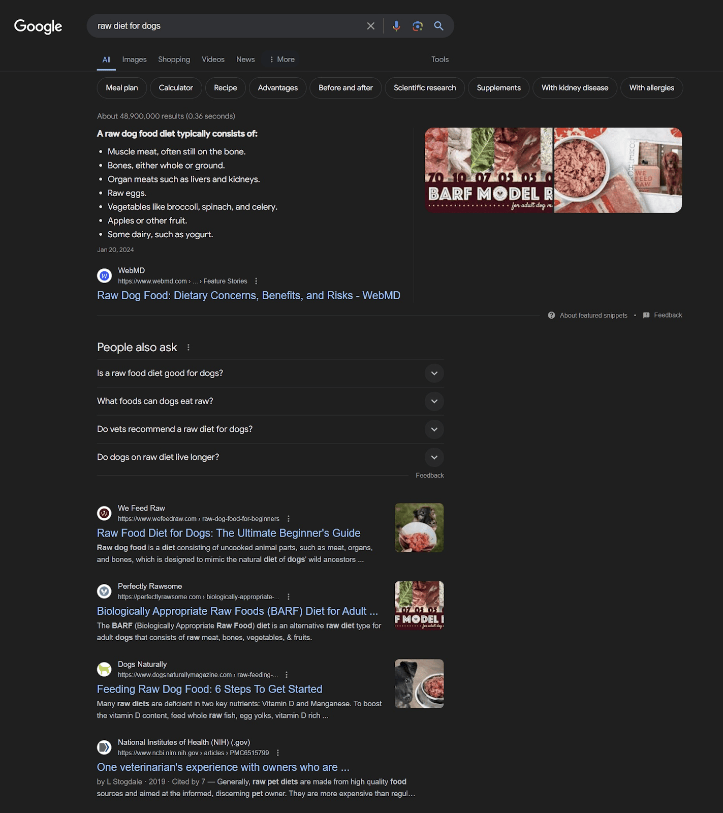
There are 210 backlinks to the exact URL of the search result, shown below.
Writers would typically be looking for quality material that they can link to in order to substantiate the material in their blog. Common things they link to include relevant news, official sources, and quality, informative material.
Whenever your Shopify store publishes quality, informative material, it allows the store to generate passive backlinks from writers looking for something to link to.
But do note that this can be difficult to pull off. You’d need to rank among the Top 3 to make it possible.
Social Media Organic Posts
You might have a healthy, loyal following on social media.
If that’s the case, you may drive traffic to your Shopify store through your social media posts.
For example, if you unveil a new product through your social media posts, you can also link your organic posts to the corresponding product’s product page.
This will drive your social media followers to the “new, raving” product that you’re flaunting.
How to Improve Traffic through Social Media Organic Posts
Here are some tips to consider when driving your social media audience to your Shopify store:
-
Hook viewers in with relevant media. Use images of the product or perhaps a short-form video of the product being used. Then, attach the respective product’s product link on the media’s caption.
-
Upload on all relevant social media platforms. However, if you’re only handling — for example — Instagram and Facebook, then upload on just those two. Don’t go out of your way to create more social accounts just to have more traffic sources.
-
Utilize different media formats. Generate traffic to your Shopify store via photos, short-form videos, photo albums, 24-hour stories, page bios, and page descriptions, among many others.
Local Directory Listings
Local directory listings let the locality know of any tourist spots, restaurants, resorts, hotels, and other establishments within an area.
Having local directory listings, such as Google Maps, may benefit brick-and-mortar establishments more than Shopify stores.
However, it can still help to have a Google Maps listing for your area of operations.
That way, people within the area can see your online store via Google Maps and visit your site.
This drives local online traffic to your store — individuals whom you don’t have to spend tons on shipping for.
How to Acquire Paid Traffic
Moving on to paid traffic, the typical paid traffic campaign consists of social media paid ads and CPC.
However, affiliate and influencer marketing can also be functionally categorized as paid ad campaigns. The same goes for traditional marketing.
Social Media Paid Ads
You may utilize paid social media ads to drive traffic to your Shopify store.
This generates traffic from a social media-dwelling target audience while also raising brand awareness in that area.
How to Begin Using Social Media Paid Ads
For this guide, we’ll focus on getting you started with the Meta Business Suite, which allows you to generate traffic from two of the biggest social media platforms — Facebook and Instagram — plus some third-party apps.
The Meta Business Suite has a campaign type dedicated to driving traffic to a website. They also have website tracking and monitoring functionalities (i.e., the Meta Pixel) which let you observe and assess the success of the traffic campaign. In addition, you can also download Facebook Ad Library to learn from the high-performing ads within your niche of business.
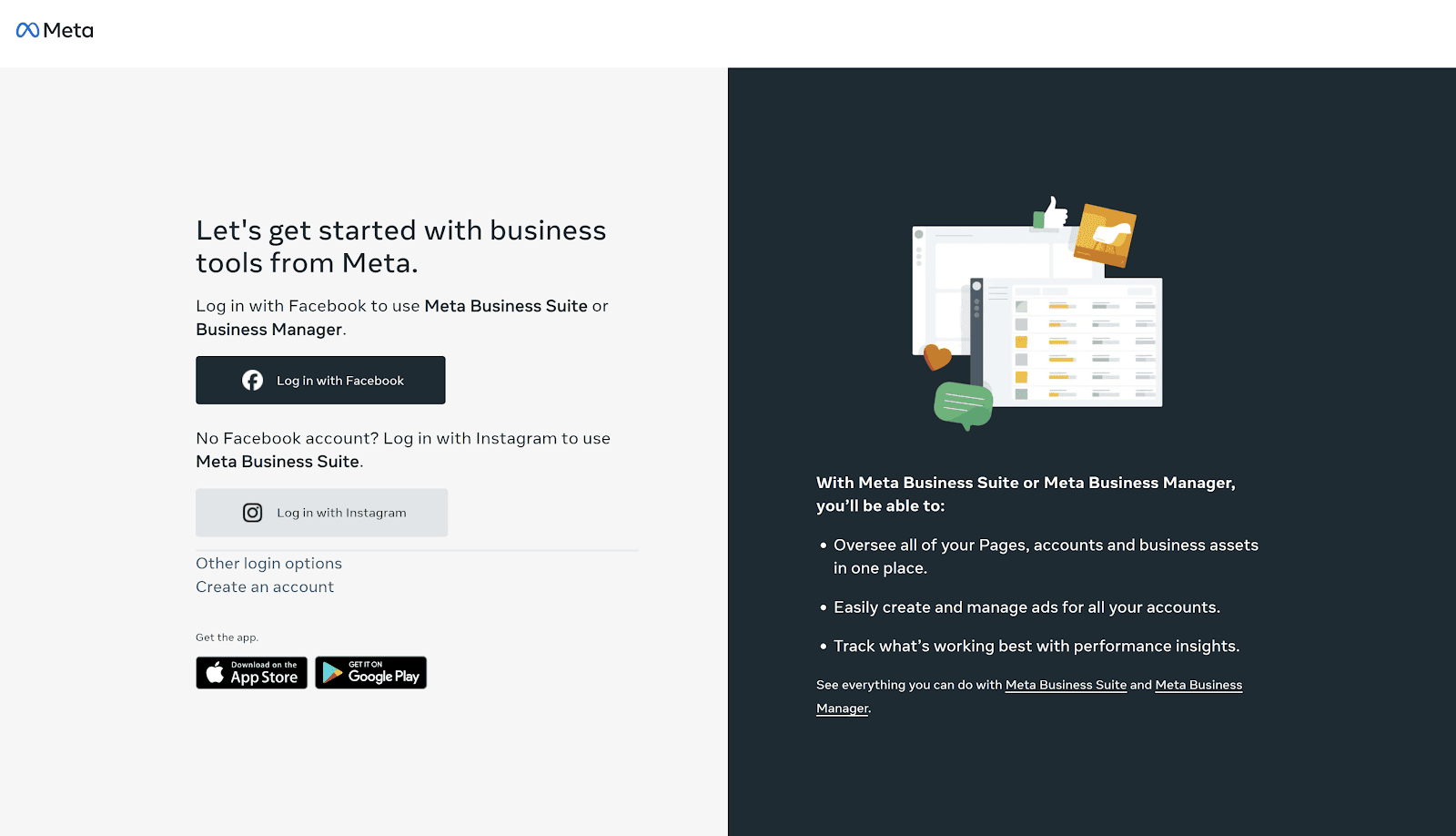
Step#1 Create a Meta Business Account
Go to the Meta Business Page and create an account.
Step#2 Link Your Business’ Facebook Page
Once you’ve created a Meta Business account, you should then link your business’ Facebook page to it.
Linking your business’ Facebook page to your newly-created Meta Business account will allow you to run paid ads for that page.
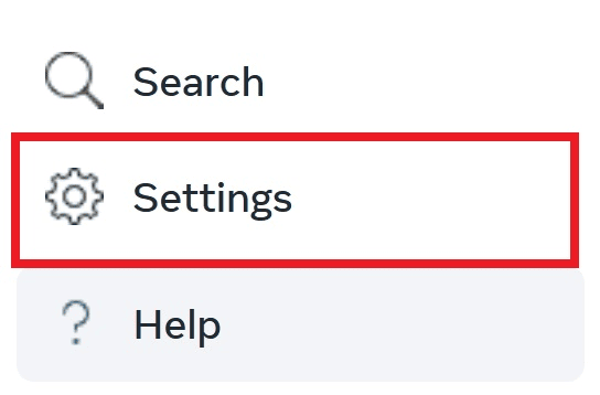
To do that, click on “Settings” in the lower-left corner of the Meta Business main dashboard.
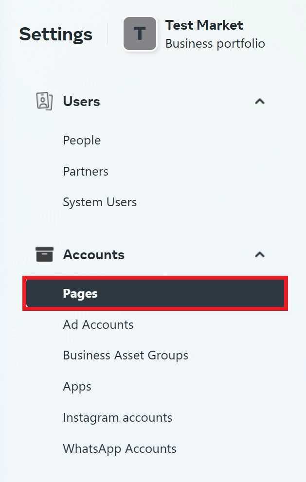
Click “Pages” underneath “Accounts.”
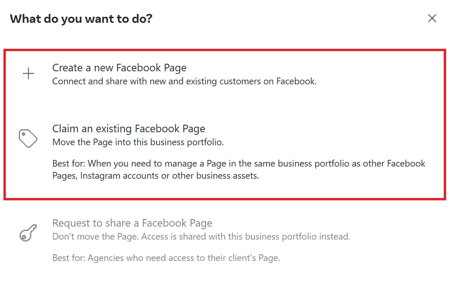
Click “+ Add.”
You have the option to 1) create a new Facebook page or 2) claim an existing Facebook page. Select the one that works best for you.
Step#3 Create an Ads Manager Account
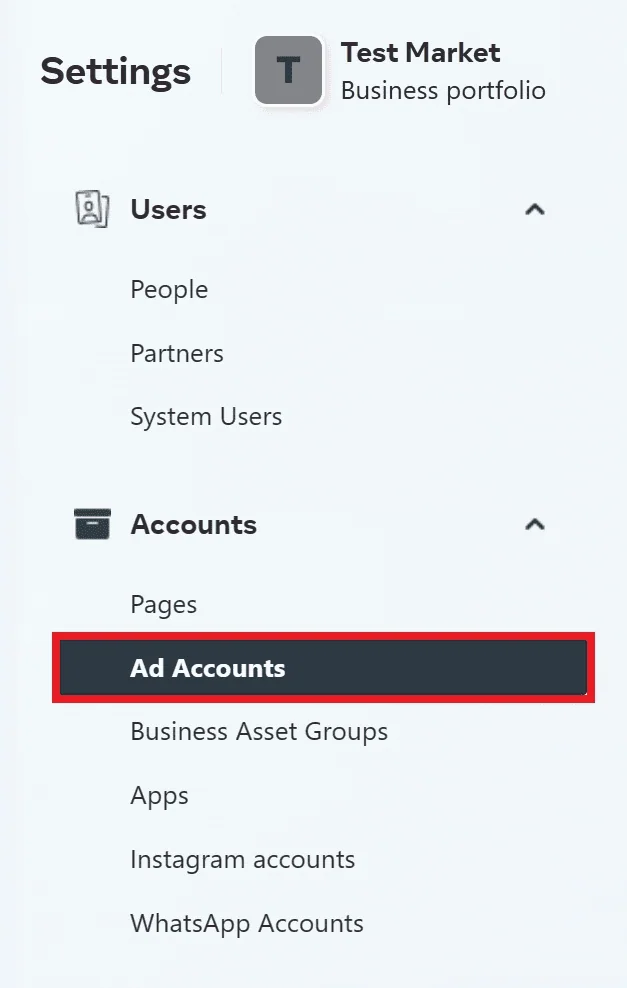
From “Settings,” go to “Ad Accounts” underneath “Accounts.”
Click “+ Add”
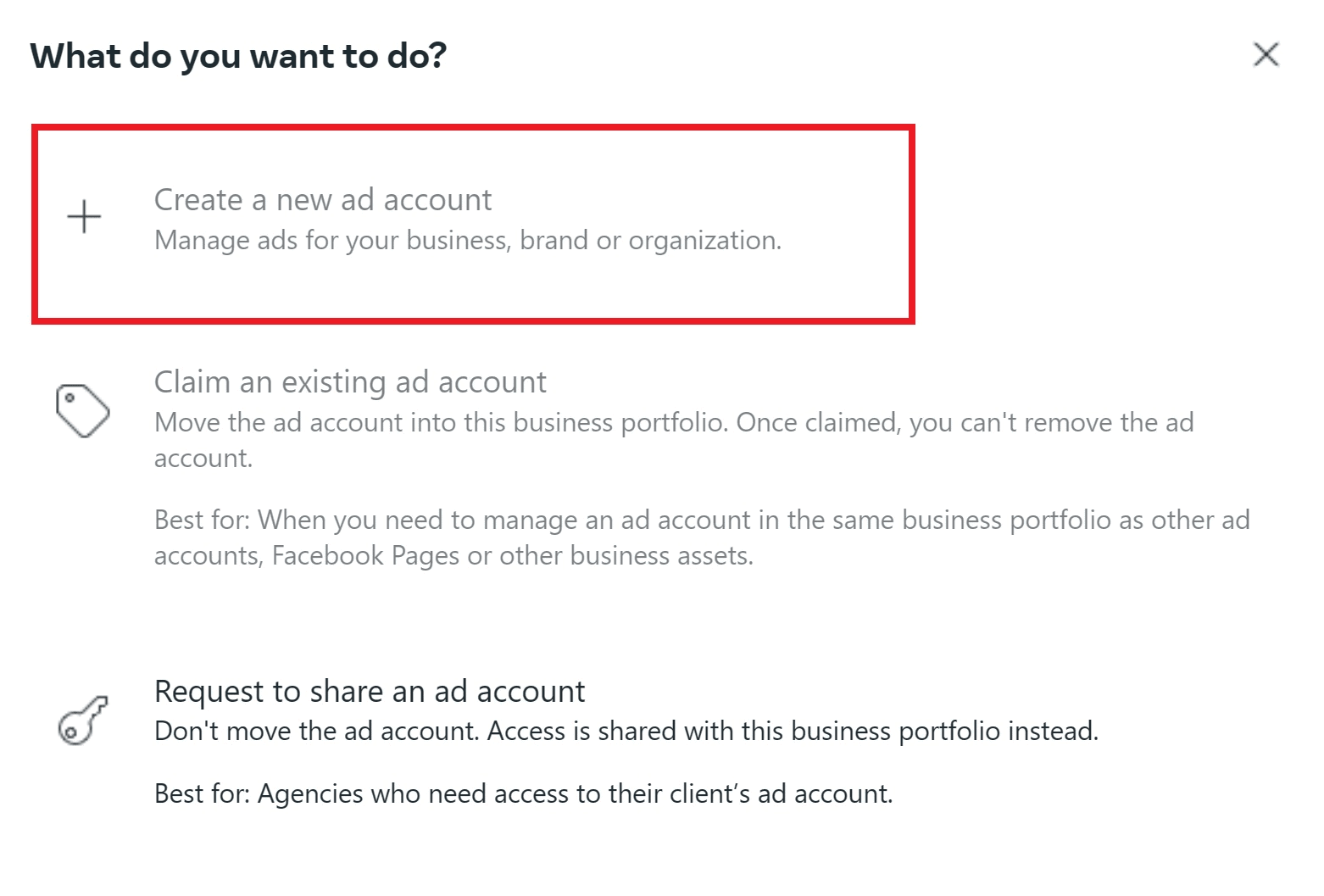
Select “Create a New Ad Account.”
Fill out the details, including payment information.
Click “Done.”
Great! You now have an ad account.
Step#4 Go to your Meta Ads Manager
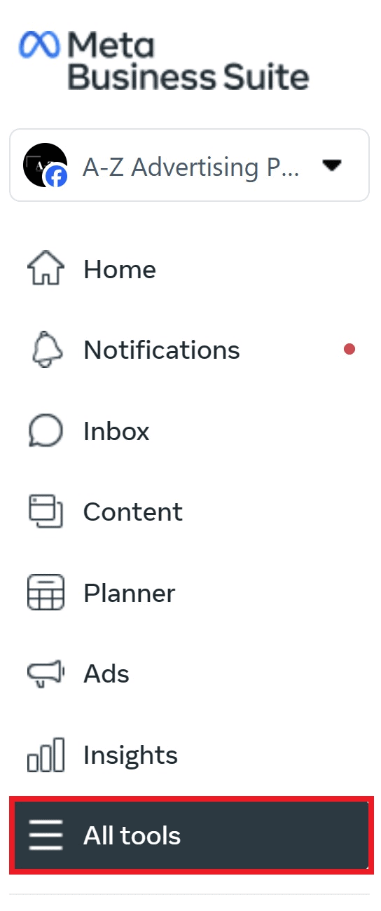
From the Meta Business main dashboard, select “All Tools.”
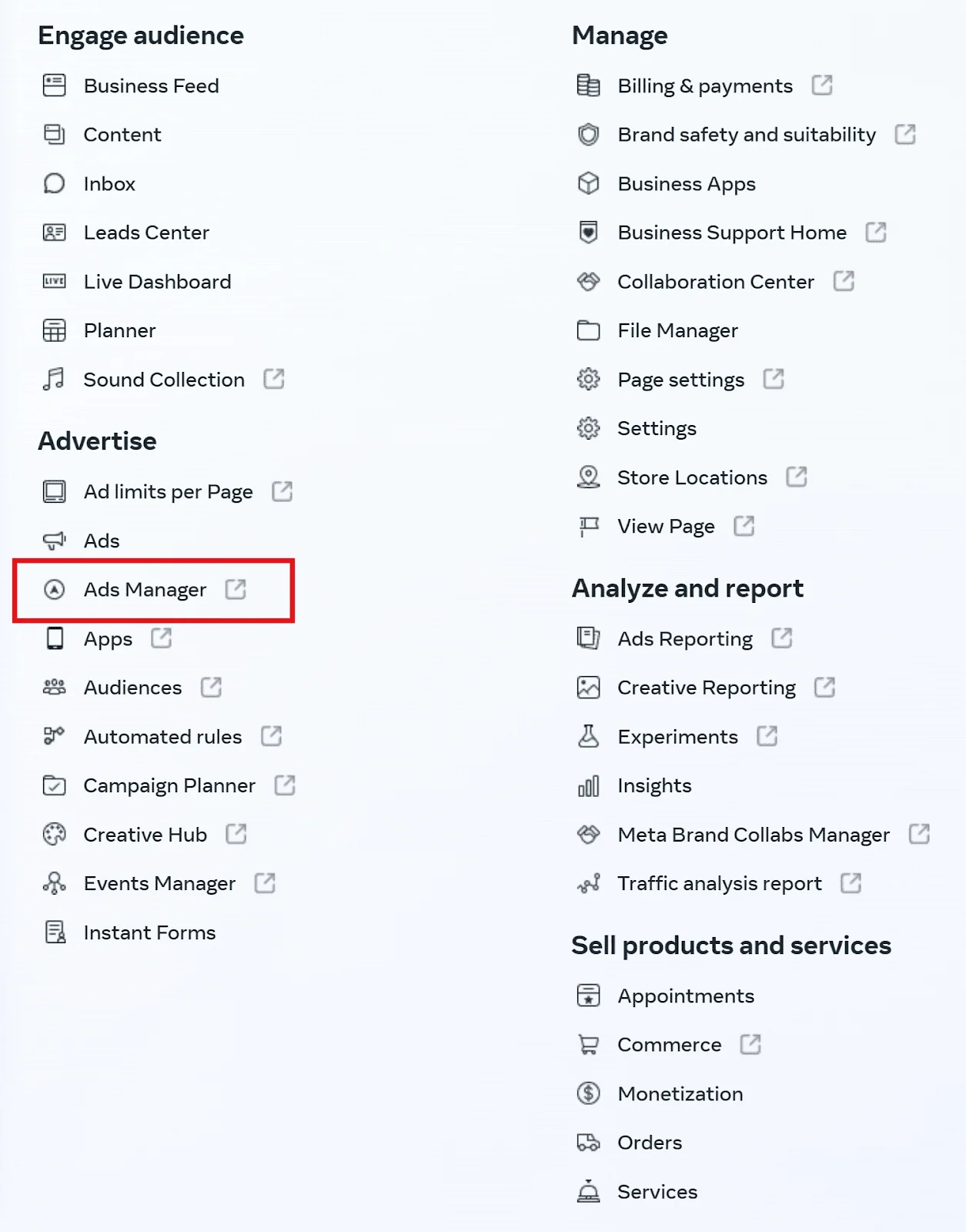
Click on “Ads Manager.”
This will take you to the Ads Manager dashboard.
Step#5 Create Your Traffic Campaign
In the Ads Manager Dashboard, you can create various ad campaigns that can benefit your business’ Facebook page and Shopify store.
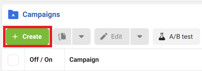
Click on green “Create” button to begin creating a new campaign.
Now, we won’t have time to discuss in-depth the different settings and fields you’ll need to fill out. We’ll leave you with some general yet helpful tips:
-
In the campaign type, select “Traffic.”
-
Determine your target audience. There’s a learning curve for fine-tuning your target audience when running Meta ads. But this is a crucial aspect to nail down for your traffic campaign.
-
Craft your creative. This can be a product photo, a short-form video, a video testimonial, etc. that potential customers will see.
-
Create your copy. This is the caption that accompanies the creative; not the in-art copy itself. You may include your URL in your ad copy.
-
Decide on a budget.
Step#6 Launch Your Traffic Campaign
Click “Publish” when you’re satisfied with your settings.
Meta will then review the ad before it goes live.
Source: Facebook
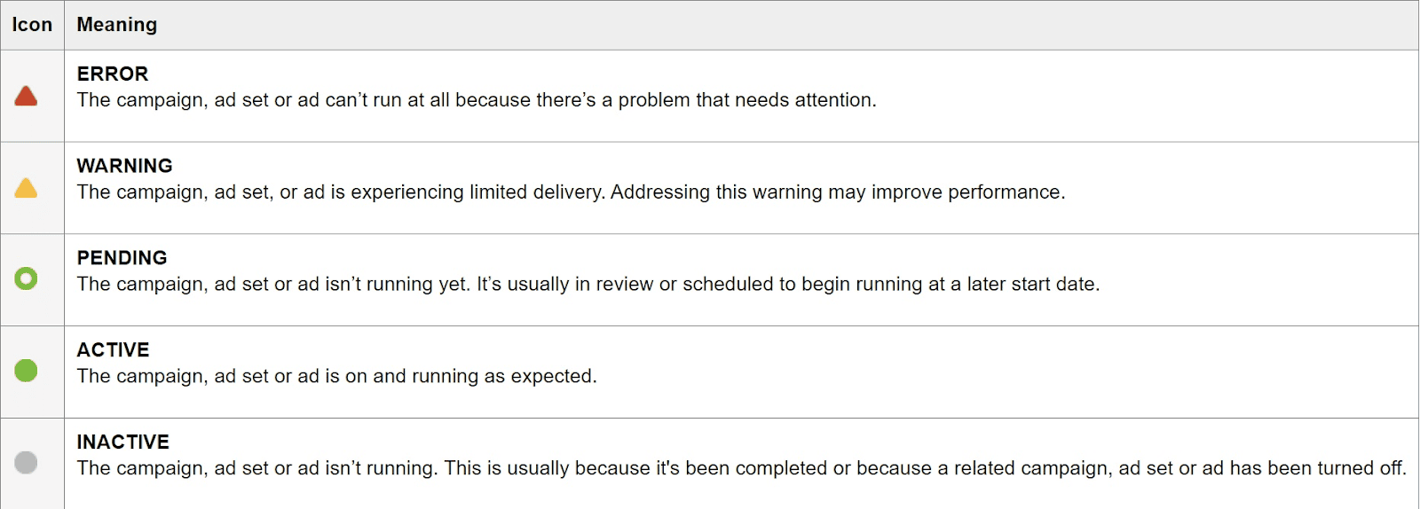
An active campaign will show as “Active” in the Meta Ads Manager.
Step#7 Track Results
Both the Meta Ads Manager and Google Analytics will be tracking your paid social campaign’s performance. So, determine the metrics that are important to you and keep an eye on them.
Refine your future approach when necessary.
CPC Ads
Cost-per-click (CPC) ads only charge the advertiser every time a lead clicks on their ad.
This makes CPC one of the more efficient paid traffic methods since you only pay for traffic that successfully comes to your Shopify store.
How to Begin Using CPC
CPC is a lengthy discussion we don’t have time to discuss in full detail.
So, instead, we’ll give some general tips on how to get started.
Step#1 Add Business Information
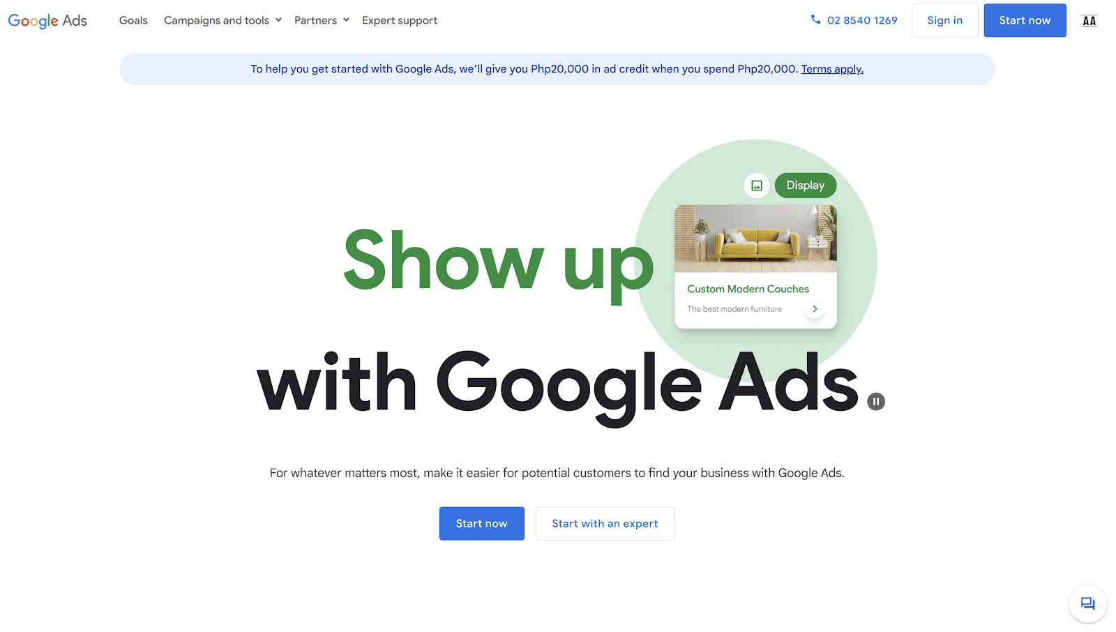
Go to the Google Ads page and click on “Start Now.”
From there, Google Ads will guide you through setting up your Google Ads account.
Google Ads will ask for your business information. Make sure to fill this out.
Don’t forget to place your Shopify business URL in the section, “Where should people go after clicking your ad?”
Step#2 Create Your Campaign
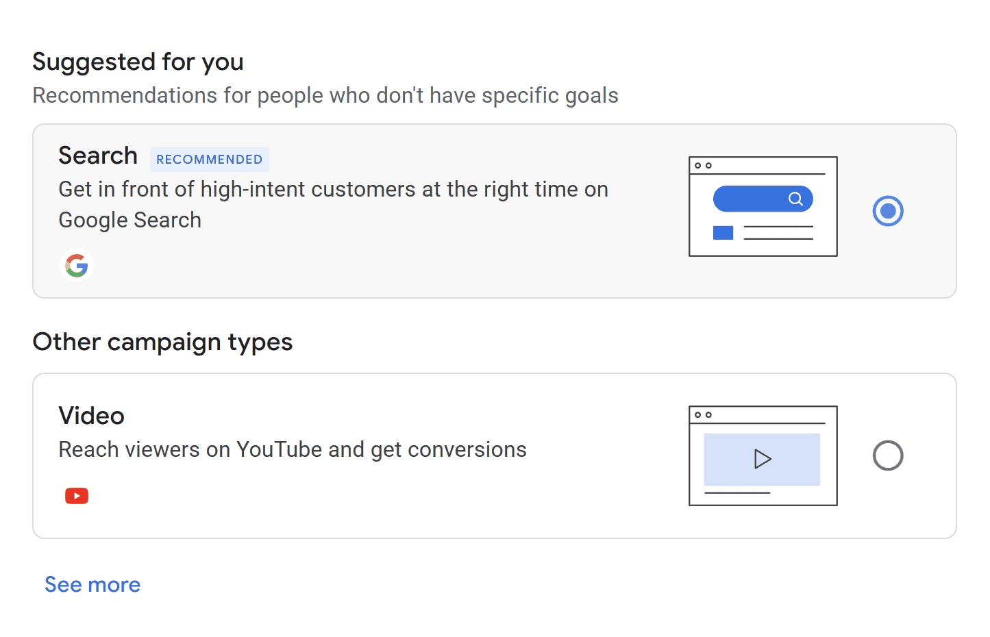
Google Ads will ask you to choose a goal, a campaign, and your keywords, among other things.
You may fill these out. But the imperative areas of focus are the following:
-
Select Search Campaign. Choosing “video campaign” will be an entirely different ad type.
-
Determine the keywords you want to appear for. Google Ads will provide suggestions after you input your initial keywords. However, we highly suggest having a robust keyword strategy before deciding on your targeted CPC keywords.
-
Determine your audience. Scrolling down in the “Select Keywords” section will take you to additional audience settings. You may tweak these settings to narrow your target audience further.
-
Create the CPC Ad. There will be a lot of customization for the CPC ad itself. You may edit the headline, description, display URL, and additional sitelinks, among other things.
-
Set a budget. Decide how much you want to allot to the CPC campaign. Do note that bidding lower than competitors may affect ad performance. Follow Google Ads’ recommendation on how much to bid.
Step#3 Publish
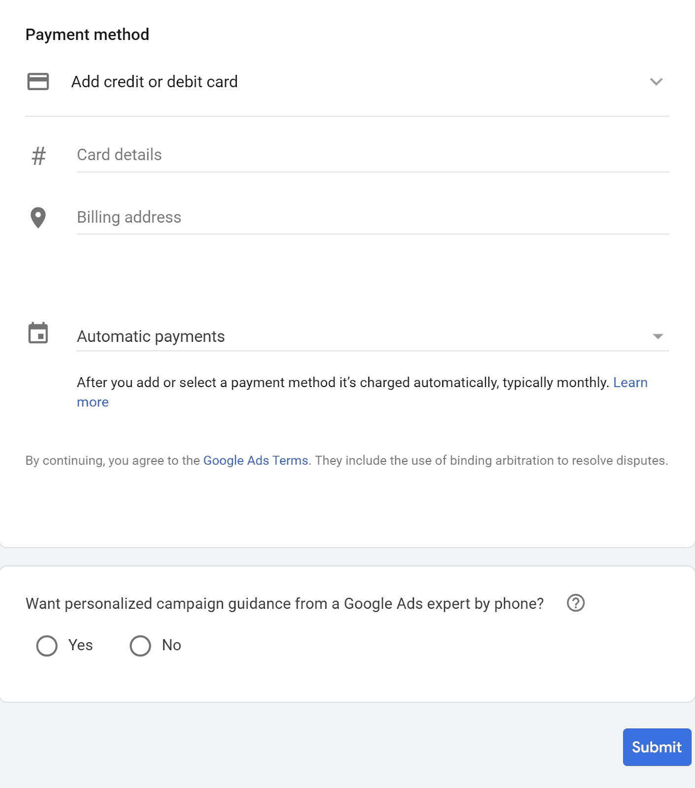
Once you’re done creating a campaign and determining a budget, you should have already reached the “Enter Payment Details” section.
Input your payment details and click “Submit.”
Affiliate Marketing
Affiliate marketing involves utilizing influencers and experts to promote your brand’s offerings.
A typical affiliate program involves giving each affiliate unique links that lead to your Shopify store or Shopify product pages.
In addition to unique links, affiliates may also be given unique discount codes that they can promote to their audience.
The unique links and discount codes track the amount of potential customers that each affiliate converts to your store, which then determines how much they get as commission.
How to Get Started with Affiliate Marketing
Here’s how you can leverage affiliate marketing to drive quality Shopify traffic to your online store.
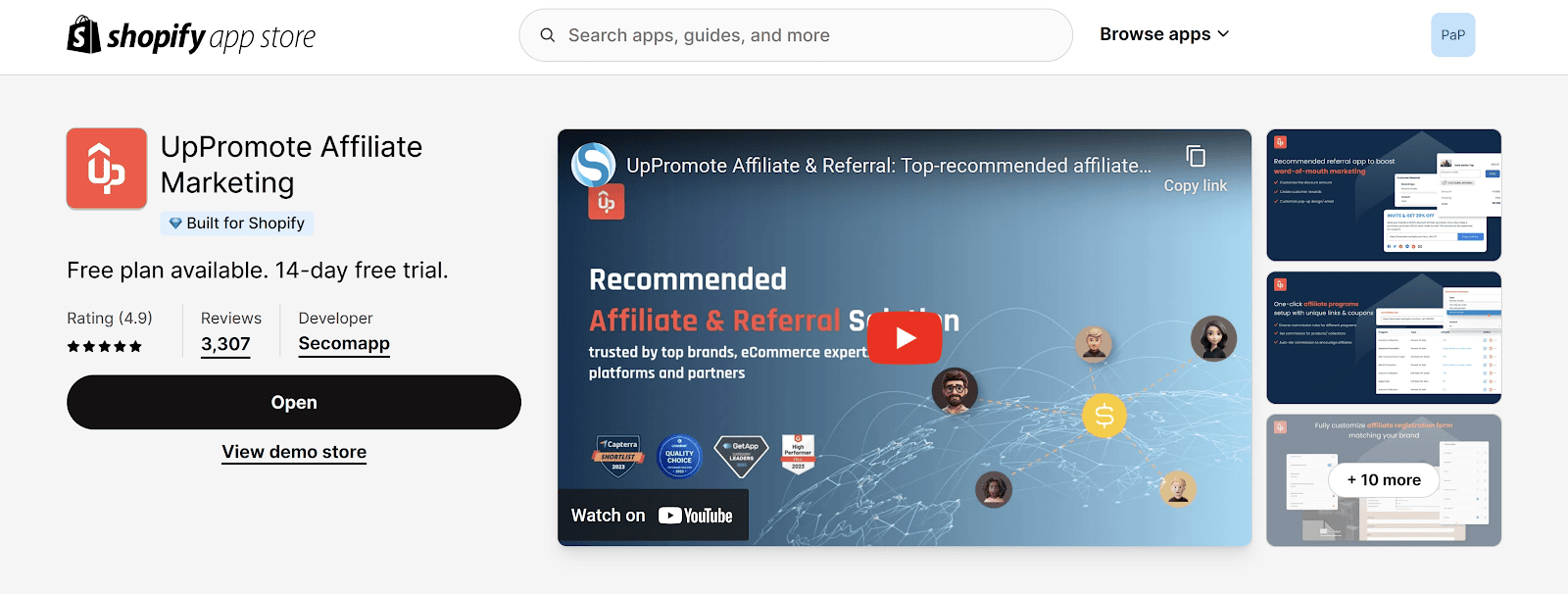
Step #1: Install the Shopify App UpPromote
Go to the Shopify App Store and install UpPromote.
Step #2: Go Through Its Onboarding
UpPromote will ask you for information and then guide you through how it works.
Follow its directions promptly.
It’s also here that you need to fill out your payment information that will be used to pay your affiliates. So make sure to add that.
Step 3: Edit your Affiliate Program
From the main UpPromote dashboard, click on “Edit Program.”
There are a few things you want to take note of:
-
Program description
-
Commission structure
-
Commission calculation
Once the settings are to your liking, click on “Save.”
Step #4: Add Affiliates
There are two ways to add affiliates. 1) You can direct potential affiliates to an affiliate form for them to fill out, or 2) you can add affiliates manually using their name and email.
Your affiliate form is located in the “Promote your registration form” section of the UpPromote main dashboard. Simply share the link on your social media pages, websites, or anywhere where you want to source affiliates.
Make sure to customize the registration form to make it look more trustworthy and on-brand.
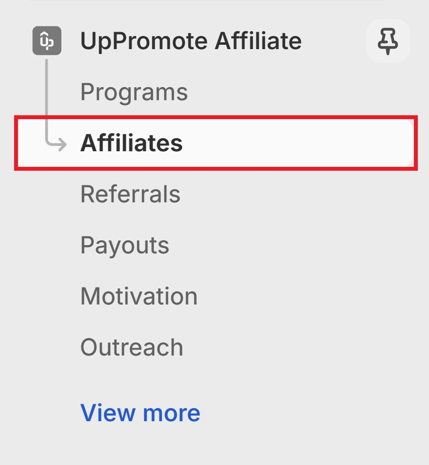
Once the affiliate registration form has been up and about for some time, check the “Affiliates” tab to see who has signed up.
Click either Approve or Deny.
For the second method, go to the “Affiliates” tab and click on “Add Affiliate.”
Input their first name, last name, and email.
Don’t forget the password that they’ll use to sign in to their affiliate dashboard.
Hit “Save” once you’re done.
Wait until they’ve received the UpPromote-generated email.
The affiliate will find their unique affiliate link there.
Once that’s done, let them get to work and wait for results.
Step#5 Monitor Their Performance
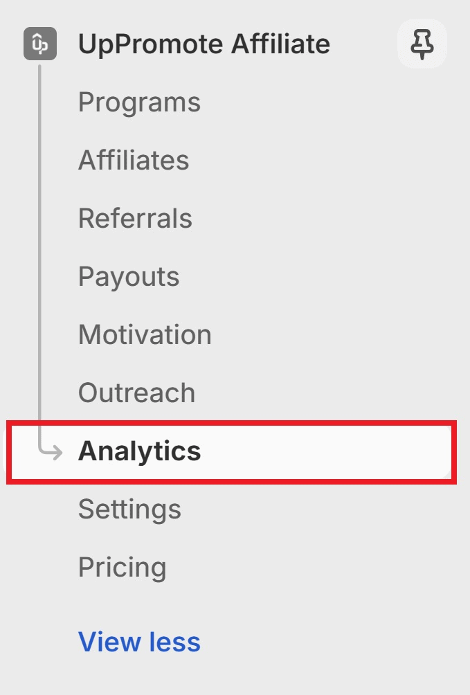
You can monitor your affiliates’ performance from the “Analytics” tab.
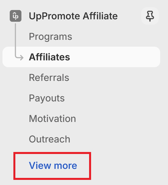
If you can’t see the analytics tab, you might need to click “View More.”
There, you’ll see the overall performance of the affiliate program, as well as each affiliate’s individual performance.
Step#6 Pay The Affiliates
Click on the “Payouts” tab.
There, you can settle payments with your affiliates pending commission.
There’s a lot more to discuss when it comes to affiliate marketing and UpPromote. But the guide above should help you get started, especially if you’re new to affiliate marketing.
Influencer marketing is a form of affiliate marketing. Once you find success with affiliates, you may leverage more reputable and established influencers to drive Shopify store traffic for you.
Pro tips: One more way to drive traffic to your Shopify store is to learn from the best. Therefore, you can look at successful Shopify store examples to get inspired by their recipe for success as well as their strategies for driving traffic.
What Does Shopify Traffic Mean for Your eCommerce Business
Shopify traffic is a terrific indicator of brand awareness and overall marketing growth. It’s also a direct ranking indicator that helps search engines determine which are spam sites and which are reputable ones.
With that said, driving traffic to Shopify store is something that all merchants should focus on. Or, hire specialized personnel to oversee.
However, it’s important to note that without the conversions, traffic only remains to be a vanity metric. So, make sure you have the proper retargeting and remarketing campaigns (e.g., email marketing campaigns, retargeted social ads, etc.) as well.













![[BFCM BIG DEALS 2026] Top 10+ Shopify Apps and Themes to Prepare for BFCM](https://static.uppromote.com/wp-content/uploads/2023/10/BFCM-UpPromote-Blog-20252-3-300x169.png)